

DashClicks Blog
The industry's top experts offer their best advice, research, how-tos, and insights—all in the name of helping you level-up your business and online marketing skills.
Join Us!
.svg)
.svg)
.svg)
.svg)
.svg)

HTML Elements: What They Are and How to Use Them
Have you ever had questions about HTML elements and how to use them effectively? Well, look no further! In this blog post, we'll walk through everything you need to know about HTML elements: what they are, their purpose in website design, and how to use them properly.
We'll also learn the basics of code syntax fundamentals so that you can write HTML confidently like a pro.
So grab your favorite mug of hot cocoa and get ready for an amazing journey into understanding HTML elements!
Overview of HTML and Its Place in the Web Development World
HTML, which stands for Hyper Text Markup Language, forms the skeletal structure of virtually every website you see on the Internet. An HTML element is the individual component of an HTML document or web page.
It's crucial in web development because it provides the raw materials that CSS and JavaScript transform into a visually appealing and interactive site. These elements, functioning as the backbone of web content, allow us to structure our sites, including content like images and videos, and create links to other parts of the site or different websites altogether.
So, understanding HTML is not just beneficial, but essential for anyone looking to delve into the world of web development.
Understanding HTML Elements: What They Are and How They Work Together?
HTML elements form the building blocks of all websites. They are the smallest units of HTML, each with a specific purpose and functionality. An HTML element typically consists of a starting tag, content, and an ending tag.
The tags are the coded instructions that define the element and its attributes, while the content is what is displayed on the webpage. For example, the '<p>' element is used to create a paragraph, and it would look like this: '<p>This is a paragraph.</p>'.
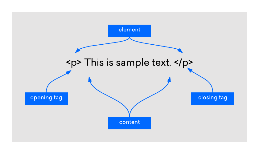
Image Source: DigitalOcean
Each element plays a unique role in shaping and structuring the webpage. Images, links, text, forms, and even the layout are all created using different HTML elements. They work together seamlessly to create the structure and content of the webpage.
By appropriately nesting these elements within each other, developers can create complex web designs. For instance, the '<a>' element, defining a hyperlink, can be nested within a '<p>' element to create a clickable text in a paragraph.
Understanding how these elements work individually and in combination with each other is a fundamental part of web development. With a solid grasp of HTML elements, you can create websites that are both visually compelling and functionally robust.
Common HTML Elements
Let's now delve into some commonly used HTML elements:
- '<div>': The '<div>' element, short for division, is a container unit designed to structure and group larger sections of HTML elements. It's a block-level element that assists in creating more complex layouts in conjunction with CSS.
- '<span>': Similar to '<div>', the '<span>' element is an inline container used to mark up a part of a text, or a part of a document. It's often used for styling purposes with CSS.
- '<img>': The '<img>' element is used to embed images into webpages. It uses the 'src' attribute to indicate the image source and the 'alt' attribute to provide alternative text for those who cannot see the image.
- '<a>': The '<a>' element defines hyperlinks, which are used to link from one page to another. The most important attribute of the '<a>' element is the 'href' attribute, which indicates the link's destination.
- '<ul>', '<ol>', and '<li>': These are list elements. '<ul>' creates an unordered (bulleted) list, '<ol>' creates an ordered (numbered) list, and '<li>' defines a list item.
- '<table>', '<tr>', '<td>': These elements are used for creating tables. '<table>' is used to create a table, '<tr>' is used to create table rows, and '<td>' is used to create table data.
- '<form>', '<input>', '<button>': The '<form>' element is used to create an HTML form for user input. '<input>' is used for input fields, and '<button>' is used to create clickable buttons.
- '<br>': The '<br>' element is an example of an empty HTML element. It is used to insert a line break in a text, which can be useful for formatting purposes. Because it is an empty element, it does not contain any content or have a closing tag. It would look like this: '<br>'.
Understanding HTML Attributes: Enhancing Elements
HTML attributes are special words used within the opening tag of an HTML element to control the element's behavior or provide additional information about it. They generally come in name/value pairs like ‘name="value"’. They enhance the capacity of an HTML element, allowing it to perform more complex tasks. For instance, the '<img>' element uses the 'src' attribute to specify the source of an image and the 'alt' attribute to provide alternative text if the image can't be displayed.
Another commonly used attribute is the 'href' attribute in the '<a>' element, which is used to specify the URL of the page the link goes to. Similarly, in the '<form>' element, the 'action' attribute specifies where to send the form data when a form is submitted.
HTML attributes add another layer of versatility to HTML, making it a powerful tool capable of creating rich, interactive, and dynamic websites. They provide a way to tailor HTML elements to our specific needs, giving us more control over the structure and functionality of our web content. Given their importance, understanding how to use attributes effectively is a crucial part of mastering HTML.
Nesting HTML Elements: Building Complex Structures
In HTML, nesting refers to the practice of inserting an HTML element within another HTML element. This is a common scenario in web development and is key to creating complex layouts and designing intricate web pages. The enclosed element is known as the 'child', while the enclosing element is termed the 'parent'.
For instance, consider the simple construction of a list in HTML using the '<ul>' (unordered list), and '<li>' (list item) elements. The '<li>' elements are nested within the '<ul>' element:
''HTML
<ul>
<li>This is the first item</li>
<li>This is the second item</li>
</ul>
''
In the example above, '<ul>' is the parent element, and the two '<li>' elements are the child elements. It's important to note that HTML elements must be properly nested. Proper nesting ensures that child elements are closed before their parent element is closed. Improper nesting can lead to unexpected layout issues and make your HTML harder to read and maintain.
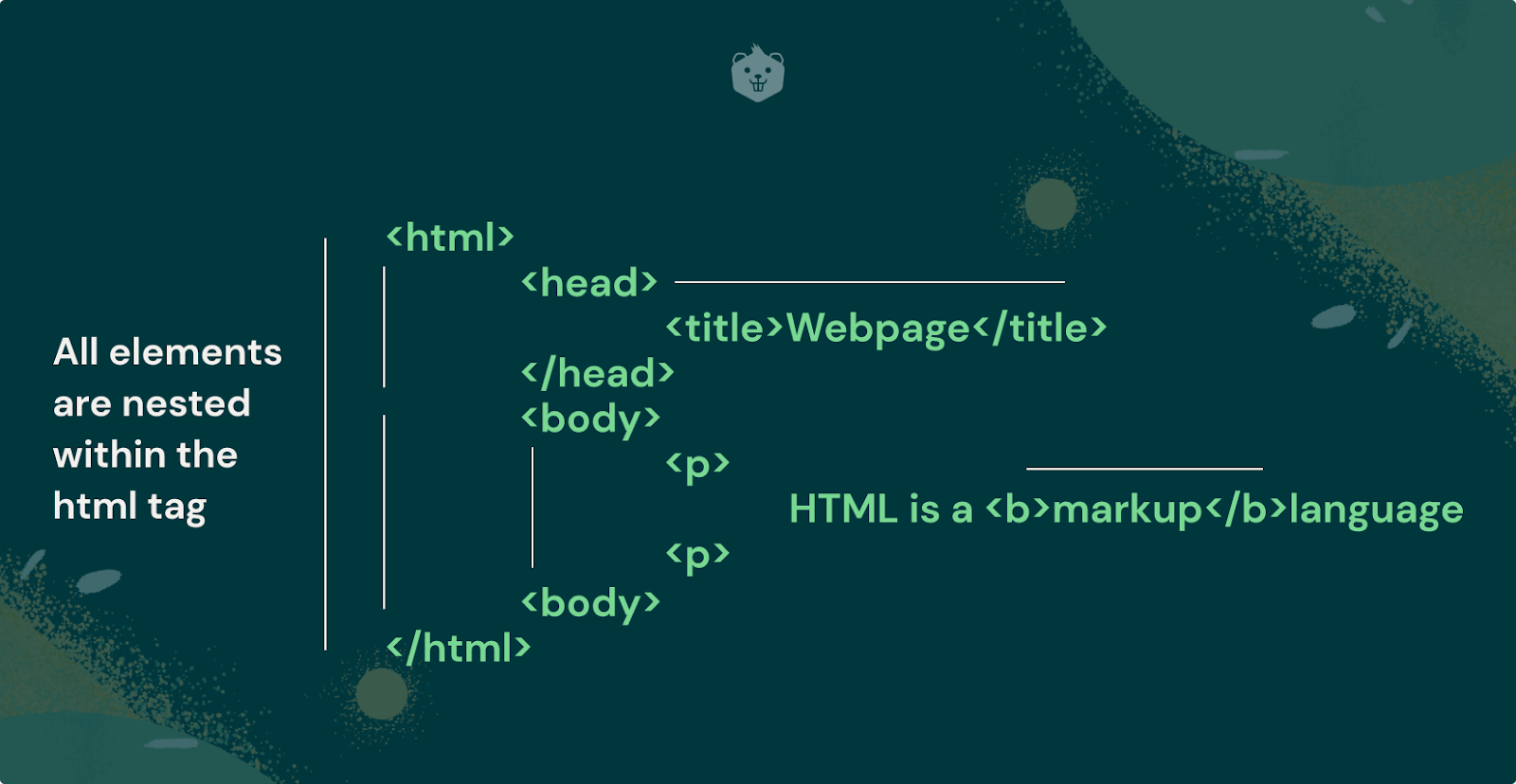
Image Source: Crio
Nesting is not limited to a single level; you can nest elements within nested elements to create a hierarchy of elements. However, while nesting elements, you must adhere to the HTML schema, which dictates what elements can be nested in other elements and the correct order of the elements. Understanding and applying the concept of nesting in HTML is vital for creating structurally sound and well-organized web pages.
Understanding and effectively utilizing these HTML elements can help you create a variety of dynamic and interactive web pages.
Tips for Organizing Your HTML Code Structure for Maximum Readability
When working with HTML, it's essential to maintain a clean, organized code structure for maximum readability and efficiency. Here are some tips to consider:
1. Indentation
Always indent child elements inside parent elements. It makes it easier to read your code and understand the parent-child relationships between elements.
''HTML
<div>
<p>This is a paragraph inside a div element.</p>
</div>
''
2. Comments
Use comments to label sections of your code. It can be especially helpful when you're working on large projects or collaborating with other developers.
''HTML
<!-- This is a comment -->
''
3. Naming
Choose clear, descriptive names for classes and IDs. Names should reflect the purpose of the element, not its appearance.
''HTML
<div id="navigation">...</div>
''
4. Consistency
Be consistent with your coding style. Whether it's the naming scheme, indentation, or syntax, consistency makes your code easier to read and understand.
5. Semantic HTML
Use semantic HTML elements when possible. Semantic elements like '<header>', '<footer>', '<article>', and '<section>' make your code easier to read and help search engines understand your content.
6. Group Related Elements
Group related content into a '<div>' or '<section>'. It helps make your structure clear and logical.
''HTML
<div class="header">
<h1>...</h1>
<nav>...</nav>
</div>
''
7. Avoid Inline Styling
Keep your HTML and CSS separate. Inline styles can make your HTML file messy and difficult to maintain. Instead, use a separate CSS file or a '<style>' tag in the '<head>' section.
Remember, a well-structured and organized HTML document makes your code easier to read and maintain and increases the performance of your website. Be sure to use an HTML code validator to ensure that your website's HTML code meets current standards and is free of errors. This step is crucial for proper website display and enhances the user experience. Additionally, having error-free HTML code can help improve your search engine optimization.
Adding Additional Information With HTML Attributes
HTML attributes provide a way to add more information to HTML elements, thereby modifying their default functionality or appearance. Attributes are always specified in the start tag and are often paired with a corresponding value.
For example, to change the color of text within a paragraph, you can use the 'style' attribute and specify the color value as follows:
''HTML
<p style="color:blue;">This is a blue paragraph.</p>
''
In this example, 'style' is the attribute name, and 'color: blue;' is the attribute value. It will render a paragraph with blue text on your webpage.
Another common usage of attributes is to specify the source of an image file for the '<img>' element. The 'src' (source) attribute is used to include the image file location:
''HTML
<img src="image.jpg">
''
Here, 'src' is the attribute name, and 'image.jpg' is the attribute value, which is the path to the image file.
It's important to note that some attributes are specific to certain HTML elements. For instance, the 'href' attribute is specific to the '<a>' element (the link element). The 'href' attribute specifies the URL the link directs to:
''HTML
<a href="https://www.example.com">Visit our website</a>
''
In this example, 'href' is the attribute name, and 'https://www.example.com' is the attribute value representing the URL.
HTML attributes significantly enhance the functionality and versatility of HTML elements, enabling you to create complex, interactive, and dynamic web content. Understanding how to use them effectively is a crucial part of mastering HTML.
Best Practices for Using CSS Alongside HTML to Enhance User Experience
CSS (Cascading Style Sheets) is a critical tool used alongside HTML to design and beautify web pages. It provides the styling and layout of HTML elements, enhancing the visual aspect of the web page and significantly improving the user experience. Here are some best practices for using CSS with HTML:
1. Use External Stylesheets
External stylesheets are the preferred method for applying CSS. They promote reusability and help keep your HTML files clean. Create a separate CSS file and link it to your HTML document using the '<link>' tag in the '<head>' section.
''HTML
<head>
<link rel="stylesheet" type="text/css" href="styles.css">
</head>
''
2. Use CSS Selectors
CSS selectors enable you to select and style HTML elements. They can be element types ('p', 'div', 'h1'), class names ('.intro', '.highlight'), or ids ('#header', '#nav').
''CSS
p {
color: blue;
}
.highlight {
background-color: yellow;
}
#header {
height: 60px;
background-color: #333;
}
''
3. Leverage the Cascade
CSS is cascading, meaning that styles can be inherited or overridden. Use this feature to your advantage by defining global styles for common elements and then specifying or overriding these styles for individual elements when necessary.
4. Use Shorthand Properties
Shorthand properties allow you to set multiple CSS properties in one line. It can make your CSS more compact and easier to read.
''CSS
/* Instead of this */
margin-top: 10px;
margin-bottom: 20px;
margin-right: 30px;
margin-left: 40px;
/* Use this */
margin: 10px 30px 20px 40px;
''
5. Group Selectors
If multiple selectors share the same style, group them to avoid repetition.
''CSS
/* Instead of this */
h1 {
color: blue;
}
h2 {
color: blue;
}
p {
color: blue;
}
/* Use this */
h1, h2, p {
color: blue;
}
''
6. Use Comments
Use comments to describe your code, especially for complex parts. It will help others (and your future self) understand your code better.
''CSS
/* This is a comment */
''
7. Organize Your CSS File
Keep your CSS file well-organized. You could group styles by element type, or by page section (header, main content, footer). Consistency is key.
Remember, the power of CSS lies in its ability to separate the design and layout from the content. This separation makes your HTML more maintainable, your styles more reusable, and your web page more accessible. And most importantly, it allows you to create a more pleasing and immersive user experience.
Further Reading: 8 Website Design Mistakes to Avoid When Building or Revamping Your Website
The website builder software by DashClicks is a powerful tool that can significantly streamline your web development process. By offering a robust and user-friendly platform, it allows you to create stunning, professional-grade websites with ease and speed.
The software is equipped with a wealth of pre-designed templates, meaning you don't have to start from scratch. You just have to choose a suitable template, add your content, and customize the design to fit your brand. The white label website builder also supports responsiveness, ensuring your website looks great on all devices.
Furthermore, it provides seamless integration with several third-party applications to extend the functionality of your websites. With the software, you can manage your web development projects more efficiently and deliver outstanding results to your clients.
Wrapping Up!
In summary, HTML is an essential part of web development. By understanding the fundamentals of HTML such as elements, attributes, and best practices it’s much easier to create a webpage. Allowing you to choose different HTML elements and customize them properly with attributes is the key to great design and user experience.
It’s also essential to understand how cascading style sheets (CSS) work to create beautiful interfaces with HTML. With a strong understanding of basic and advanced concepts in HTML, you can start crafting amazing websites today!
If you want even more tips on how to get started learning HTML then visit my blog for more content about web development!


8 Website Design Mistakes to Avoid When Building or Revamping Your Website
Designing and maintaining a website can be daunting, but with the right tools and knowledge, you can create an amazing user experience that drives sales or leads. However, there are some key design mistakes you will want to avoid to achieve success.
From poor navigation flow to cramming too much content onto one page, these web design mistakes could prevent visitors from engaging and converting to your site. In this blog post, we discuss eight of the biggest web design mistakes you will want to steer clear of when building or revamping your website.
1. Not Optimizing Your Website for Mobile Devices and Other Platforms
In this day and age, businesses must have a strong online presence. With so many users accessing websites on their mobile devices, it's more important than ever to ensure that your website is optimized for all platforms.
If your website isn't responsive, you could be missing out on potential customers and losing valuable business. Don't let your website fall by the wayside - make sure that it looks great and functions seamlessly on any device, whether it be a desktop computer, tablet, or smartphone.
By taking the time to optimize your website, you can attract more visitors and provide a better user experience for all.

Image Source: Dinarys
2. Failing to Focus on the User Journey
In the world of UX design, one of the biggest mistakes you can make is failing to focus on the user journey. It might sound like a minor error, but it can have a huge impact on the success of your website or app.
If users are confused or lost when navigating through your platform, they'll quickly lose interest and move on to a competitor. That's why it's crucial to provide a clear, easy-to-follow path that guides users to their destination.
By putting yourself in the shoes of your users, you can ensure that their journey is smooth and seamless, ultimately leading to higher engagement and greater overall satisfaction.
3. Ignoring SEO Best Practices
In today's digital age, having a website that stands out from the rest is crucial. However, just having a website is not enough. To attract more visitors and improve your ranking in search engine results, it's important to incorporate SEO best practices into your website content.
By using keywords and phrases throughout your website, you improve your chances of being found by potential customers on search engines like Google or Bing. While it may be tempting to ignore SEO in favor of more creative content, doing so may ultimately hurt your digital presence.
Don't let your website go unseen – implement SEO best practices and watch your traffic soar.
4. Not Planning for Future Updates
It's important to anticipate that your website will require updates and changes in the future. Any website that hopes to remain relevant and effective must be dynamic and able to adapt to the ever-evolving demands of the digital world.
Without proper planning, updates can cause unnecessary downtime or create changes that disrupt the user experience. To avoid this, create a detailed plan for how routine updates will be carried out.
Consider factors like how often the site will be updated, who will be responsible for implementing the updates, and how these updates will be communicated to users. By thinking ahead and planning for updates, you can ensure that your website remains current and continues to deliver an optimal user experience.
5. Utilizing Too Many Fonts or Colors
In an attempt to make a website visually appealing, some designers fall into the trap of using a multitude of fonts and colors. However, this often results in a design that is overwhelmingly busy and visually chaotic, causing strain on the viewer's eyes.
Furthermore, inconsistency in fonts and colors can make your website look unprofessional and disjointed. It's recommended to use a consistent color scheme and limit the number of fonts used on your website.

Image Source: Brave & Co Design
Typically, a harmonious mix of two to three fonts and colors is sufficient. By doing this, your website design maintains uniformity, looks professional, and is easy on the viewer’s eyes, enhancing the overall user experience.
6. Incorrectly Using Visuals on the Page
Incorrect use of visuals on the page is another common mistake to avoid when designing your website. Visuals, including images and videos, undoubtedly play a critical role in enhancing the aesthetic appeal and user engagement on your site.
However, incorrect sizing, positioning, and placement can negatively affect your site's load speed and overwhelm the viewer. Make sure your visuals are appropriately sized, not too big that they slow down your site's load speed or too small that they lose their impact.
Position them strategically and ensure they're relevant to the content surrounding them. Balance is key; too many visuals can be just as detrimental as having none at all. By correctly using visuals, you make your page more attractive and maximize viewer engagement and retention, leading to better conversion rates.
7. Neglecting to Use Clear Calls-To-Action (CTA)
It's crucial to recognize the role of clear call-to-action (CTAs) in effective website design. CTAs are prompts that guide users toward specific actions you want them to take, such as signing up for an email newsletter, downloading an ebook, or purchasing a product.
They act as signposts guiding users to the next step and play a crucial role in driving conversions. However, not all CTAs are created equal. A successful CTA must be visually appealing, clear, and concise, effectively communicating what users will gain by taking the suggested action.
A poorly designed or missing CTA can mean missed opportunities for engagement and conversion, which can negatively impact your website’s bottom line. By strategically incorporating CTAs into your web design, you can guide user behavior and improve the overall effectiveness of your website.

8. Forgetting About Accessibility
Overlooking accessibility considerations is another common yet significant mistake in website design. Accessibility ensures that your website can be navigated and understood by all users, including those with disabilities.
It's important to implement features such as alt text for images, captions for videos, and high-contrast text for visually impaired users. Keyboard navigation should be possible for those who can't use a mouse, while a simple and intuitive site structure benefits those with cognitive disabilities.
Failure to consider these features may exclude a portion of your audience, which results in missed opportunities and contravenes inclusivity principles. Incorporating accessibility into your website design ensures it is user-friendly for everyone, consequently widening your potential user base and enhancing your overall user experience.
DashClicks offers a powerful white label website builder platform that simplifies the website design and development process, empowering businesses to create stunning, SEO-optimized websites efficiently and effectively. This comprehensive software is feature-rich, offering solutions to many common website design challenges.
The software comes with a user-friendly interface that allows for the intuitive design and customization of websites. It's packed with templates that are not only appealing but also mobile-responsive, ensuring your website looks great on all devices.
One standout feature of the is its built-in SEO capabilities. It simplifies the task of optimizing your website for search engines, allowing you to incorporate keywords and phrases seamlessly into your content. This feature can potentially improve your website's ranking in search engine results, attract more visitors, and boost your online presence.
The white label drap and drop website builder also promotes regular updating and maintenance of your website with its easy-to-use management tools. It is designed to facilitate seamless updates and revisions, reducing the likelihood of any disruption in user experience due to changes or downtime.
Additionally, the application stresses the importance of a clear and compelling CTA (Call To Action). It provides you with the tools to create and position your CTAs strategically, driving conversions and user engagement on your site.
Lastly, the website builder software recognizes the significance of website accessibility. It comes with features that enhance your website's accessibility, making it user-friendly for individuals with disabilities.
The software is a robust tool that can elevate your website design process, making it simpler, more efficient, and result-driven. Whether you're aiming for an attractive design, improved SEO, or enhanced user experience, DashClicks has got you covered.
Summing Up
Take the time to properly plan and design your website, ensuring you are not making any of the 8 Mistakes that Could be Hurting Your Website Design. It will make sure that all users have a great experience on your website regardless of the device or platform they are on.
Remember to stay up to date with web trends and best practices to ensure your website is optimized for success! Now, go ahead and take that first step towards building a beautiful, fully functional, and successful website while avoiding common design mistakes!


13 Key Website Performance Metrics to Ensure Client Success
As the digital world continues to evolve, so does the need for businesses to ensure they’re executing an effective website performance strategy. Achieving success online hinges on being able to monitor and analyze key metrics related to user engagement, search engine visibility, customer service response times, and more.
With this in mind, we’ve compiled a list of 13 essential website performance metrics that can help organizations stay ahead of their competition in today’s ever-changing landscape. Read on to learn how these key indicators from time-on-page analytics to pages per session data can provide measurable steps towards greatness with every customer interaction your organization executes!
1. Quality of the Site’s Codebase
Websites have become the virtual storefronts of businesses, and their performance is key to attracting and retaining customers. One crucial aspect that impacts website performance is the quality of the site's codebase.
A well-maintained codebase ensures that a website loads faster, has a smoother user experience, and provides better security. Websites with subpar codebases are likely to encounter issues such as long loading times, broken links, and cross-browser compatibility concerns; all of which can impact user engagement and retention.
That's why website performance matters, and why businesses should ensure that their codebase is up to date with the latest standards and optimized for speed to tick all the boxes in terms of website performance and customer satisfaction.
2. Page Speed Performance
In today's digital age, having a website that loads quickly is key to providing a positive user experience. Page speed performance is a crucial website performance metric that measures how quickly a website loads for visitors. A slow-loading website can be frustrating for users and can lead to a decrease in website traffic.
Therefore, website owners need to monitor and optimize their page speed performance. By doing so, they can ensure that their website is running smoothly and efficiently, leading to a better user experience and increased engagement.
3. Time on Page & Bounce Rate
One of the most crucial aspects of managing a website is measuring its performance. You'll want to understand how visitors interact with your pages, and two key metrics to help you do that are time on page and bounce rate. Essentially, time on page looks at how long someone stays on a specific page of your site, while bounce rate measures the percentage of visitors who leave your website after viewing only a single page.
To measure these metrics, you'll need to leverage a few tools. The first is Google Analytics, which can provide in-depth insights into how visitors engage with your site.

Beyond that, you can also employ various A/B testing tools and user feedback forms to get a better sense of your website's strengths and areas for improvement. By keeping tabs on time on page and bounce rate, you'll be well on your way to improving your site's performance and user experience.
Further Reading: 13 Tips to Reduce a Website's Bounce Rate and Increase Conversions
4. Mobile Friendliness
In today's world, everyone is constantly on the go, so having a mobile-friendly website is essential. If your website isn't viewable or functioning properly on mobile devices, you could be missing out on a lot of potential traffic and business. It's important to keep in mind why website performance matters - a slow or non-responsive website can turn away potential customers and hurt your credibility.
By ensuring your website is mobile-friendly, you're not only accommodating the needs of your current customers, but you're also opening yourself up to a wider audience. So, take the time to optimize your site for mobile devices and reap the benefits of a seamless user experience.
5. Largest Contentful Paint (LCP)
This is the amount of time it takes for the largest piece of content on your website to load up on a server request from a user or visitor. Naturally, as with page load times, keeping this time minimal is essential to ensure visitors stay on your website longer and find it useful and engaging.

Image Source: DebugBear
Another important fact to consider is that LCP falls under the list of Google’s Core Web Vitals, meaning this value directly impacts the ranking and eventual categorization of your website in Google’s website ranking algorithm.
If you’re wondering how long an ideal LCP time should be, experts and research suggest keeping it under 2.5 seconds, as that time ensures ideal customer retention and engagement rates for your website.
6. Security & SSL
Ensuring the security of your visitors' data is paramount for any website owner. One of the best ways to accomplish this is by implementing SSL encryption, which effectively encrypts any data that is transmitted between the website and a visitor's browser.

Not only does this provide better website data security, but it also helps to increase trust in your website among your visitors. But how do you measure the performance of your SSL? One critical metric is the speed at which your page loads, which should not be significantly impacted by the SSL encryption.
Additionally, you may want to consider implementing tools that allow you to monitor SSL errors or security vulnerabilities to stay ahead of any potential threats. With these steps in place, you can enjoy the peace of mind that comes with knowing that your visitors' data is secure and your website is performing at its best.
7. Time to First Byte (TTFB)
Have you ever found yourself getting frustrated while waiting for a website to load? The culprit could be the Time to First Byte (TTFB), which is the amount of time it takes for your browser to receive the first byte of information from the web server.
TTFB is a crucial factor in website performance because it affects how quickly users can fully access and interact with websites. In today's fast-paced digital world, users have high expectations for website speed, and slow TTFB can negatively impact user experience and ultimately lead to lost traffic and revenue.
That's why website performance matters and TTFB is an important metric to measure and optimize.
8. Time to Interactive (TTI)
With countless websites available on the internet, businesses must ensure their website stands out from the rest. Website performance metrics, such as Time to Interactive (TTI), play a significant role in achieving this goal. TTI is a measurement of how long it takes for a website to fully load and become interactive for a user.

Image Source: 10Web
It factors in various elements such as images, videos, and scripts. A website with a fast TTI is likely to engage users more successfully than one with a slow TTI. Thus, businesses must pay attention to website performance metrics like TTI to ensure their website provides the best user experience possible.
9. First CPU Idle
In today's digital age, website performance is critical. Visitors expect fast-loading pages and seamless navigation. As a web developer, it's your job to ensure your website performs at its best. One of the essential metrics to measure website performance is First CPU Idle. It's the point at which the CPU is idle enough to process input and doesn't bog down the user's experience.
To measure this, you need to simulate a user's interaction with the website and record the time it takes for the CPU to become idle. By tracking this metric, you'll be able to identify any bottlenecks on your website and improve its performance, ensuring your visitors have a smooth experience.
Further Reading: 8 Tips to Improve the Time Visitors Spend on Your Website
10. Total Page Size
In today's fast-paced digital world, website performance matters more than ever. Total page size is a critical factor to consider when it comes to enhancing the overall user experience. The more data that is being loaded, the slower the website becomes. It may sound insignificant, but even a few milliseconds of delay can cause frustration among users and ultimately lead to decreased traffic.
This is especially true for mobile users who are always on the go and expect immediate access to information. By optimizing the total page size, businesses can not only improve website performance but also increase user engagement and ultimately drive conversions.
11. Number of HTTP Requests
When it comes to monitoring website performance metrics, one important factor to consider is the number of HTTP requests. Each time a user visits a webpage, their browser has to make a request to the server for every element on that page, from images and videos to scripts and stylesheets. This can quickly add up, slowing down website load times and frustrating users.
By keeping an eye on the number of HTTP requests being made, website owners and developers can work to optimize their pages and improve overall performance. After all, a speedy website not only keeps visitors happy but also helps to improve search engine rankings.
12. Max First Potential Delay (Max FID)
As website owners, we all want our pages to load as fast as possible. Slow load times can lead to frustrated visitors and lost business opportunities. So, how can we measure the performance of our website to ensure a speedy user experience? One important metric to keep in mind is the Max First Potential Delay or Max FID. This measures the amount of time it takes for the content on the website to become interactive.

Image Source: DebugBear
In other words, how long does it take for a visitor to be able to click on a button, fill out a form, or interact with any other element on the page? By tracking Max FID, we can identify any potential roadblocks that are slowing down our website and take steps to improve our overall performance.
13. Cumulative Layout Shift (CLS)
Have you ever clicked on a website link, only to find that the content keeps shifting around? This can be frustrating for users, and it's all thanks to a website performance metric called Cumulative Layout Shift (CLS). CLS measures how much visual stability a website has as it loads, meaning that the less shifting and jumping around the user experiences, the better the website's score.

Image Source: DebugBear
A high CLS score can negatively impact user experience and ultimately turn people away from your site. To ensure that your website provides a smooth and stable user experience, it's important to pay attention to its CLS score and address any issues promptly.
DashClicks’ Website Builder: Creating and Analyzing Websites With Ease
In the realm of website creation and analytics, DashClicks’ website builder stands as an exceptional tool. The platform is designed to help users create stunning, high-performing websites by offering a comprehensive set of features.
With the white label website builder, you can select from a myriad of design templates to build a professional and visually appealing website. These templates are optimized for various industries, ensuring your site aligns with your business goals. Furthermore, the platform provides advanced SEO features to enhance your site's visibility and reach.
The software doesn't just stop at creation; it also allows users to track and analyze their website performance. It integrates with various analytics tools, including Google Analytics, to provide real-time data on key performance metrics. Users can monitor metrics such as time on page, bounce rate, and many others discussed earlier, to optimize their site's performance continually.
With robust security features, mobile optimization, and the ability to monitor SSL performance, the software ensures your website is secure, user-friendly, and performs optimally across all devices. This enables businesses to provide their customers with a seamless digital experience, leading to increased engagement and conversion rates.
By combining website creation and analytics in a single platform, DashClicks simplifies the process, saving time and resources while ensuring the creation of high-quality, high-performing websites.
In Conclusion
Site performance and user experience are crucial factors when it comes to designing websites today. There are many elements to take into consideration when optimizing a website, such as its codebase, page speed, time on page & bounce rate, mobile friendliness, HTTP Requests, security & SSL, time to first byte (TTFB), time to interactive (TTI) First CPU Idle, total page size, number of HTTP requests, max potential delay (Max FID), and cumulative layout shift (CLS).
All of these factors must come together to achieve the maximum optimization possible. As optimized websites become increasingly important in today’s competitive digital landscape, taking the necessary steps to optimize your website can seem overwhelming, but will be key in making sure that your site runs optimally for users.
There is no one-size-fits-all approach, so you should utilize a combination of the steps mentioned here and use web analytics tools to better monitor changes made over time. As time passes, you can add even more elements as website optimization technologies catch up with current trends in technology.


The Value of Brand Consistency on Landing Pages
Brand consistency is integral for any business, as it helps develop a better user experience and customer loyalty. It’s even more important on your landing page – the primary interface between you and your potential customers.
The first impression a visitor has of your business relies heavily on how consistent and reliable your brand appears through its visual identity. To engage users with the highest possible level of purpose, use these creative strategies to ensure successful brand consistency in every touchpoint they have with you!
In this blog post, we will be discussing why brand consistency is so important when it comes to creating attractive landing pages, how to ensure that all of the elements are working together within a cohesive design, and what steps can help bring out the full power of consistent branding techniques throughout webpages.
What Is Brand Consistency and Why Is It Important for Your Business?
Brand consistency refers to having a uniform approach to branding across all platforms and mediums for your business. It includes everything from your logo and color palette to your messaging and overall tone.
It's essential to maintain consistency in branding because it helps build a strong reputation and differentiate your business in a crowded market. When customers recognize the same elements across all channels, it creates trust and makes it easier for them to remember your brand. Inconsistency, on the other hand, can lead to confusion and mistrust.

Image Source: Podia
Brand consistency is crucial for establishing a strong brand identity and, ultimately, increasing brand loyalty and customer retention.
Implementing a Consistent Brand Message Across All Landing Pages
No matter the industry or business type, having a consistent brand message across all landing pages is critical to success in today's digital age. A visitor should be able to land on any page of your website and immediately understand what your brand is about.
Whether you are a startup or an established company, implementing a consistent brand message is a must-do for any successful digital marketing strategy. Here’s how you can implement it.
1. Create a Brand Style Guide
Begin by creating a comprehensive brand style guide that outlines all the design elements that your brand uses including logo, color palette, typography, and any other visual elements. It will ensure a unified aesthetic across all your landing pages.
2. Consistent Logo Placement
Place your logo consistently on each landing page, typically in the top left corner. It helps in immediate brand recognition and imparts a sense of familiarity to the visitor.
3. Uniform Typography and Color Scheme
Use the same typography and color scheme across all your landing pages to reinforce brand consistency. These elements are a significant part of your brand identity and contribute to the overall visual impact.

Image Source: Planable
4. Maintain Consistent Messaging and Tone
Your brand's message and tone should be consistent across all landing pages. This consistency in communication helps build trust and rapport with your audience.
5. Consistent Call-to-Action (CTA) Buttons
Ensure the design and language of your Call-To-Action buttons are consistent across all pages, making it easier for visitors to move through the conversion funnel.
6. Maintain Consistency in Imagery
Use images, illustrations, and icons that adhere to your brand's style guide. Consistent visual storytelling strengthens your brand's identity and enhances user experience.
Here is an example of Starbucks. Starbucks has changes his logo several times, and yet his centerpiece has remained consistent, showing how visual brand consistency is an integral part of a consistent brand image.

By executing these steps, you can implement a consistent brand message across all landing pages, fostering trust, recognition, and ultimately, customer loyalty.
How to Ensure Brand Consistency Across Different Landing Pages?
In today's digital age, a strong online presence is vital for any brand looking to make a mark. One of the key components of this online presence is a well-designed landing page.
Whether you're using landing pages to generate leads or promote a specific product, you must ensure your brand is consistent across all pages. Here’s how you can ensure brand consistency across the landing pages:
1. Design Layout Consistency
Maintain a consistent design layout across different landing pages. It includes consistent placement of elements like header, footer, navigation, text blocks, images, and CTA buttons. A consistent layout brings a familiar feel to your audience, which can enhance user engagement and boost conversions.

Image Source: Maze
2. Standardized Content Structure
Develop a standardized content structure that you adhere to across all landing pages. It includes the order in which information is presented, headings and subheadings, and the layout of text and images. Standardized structure helps your audience know what to expect and where to find information.
3. Regular Audits and Updates
Regularly audit and update your landing pages to ensure all elements adhere to your brand’s style guide. It is particularly crucial when introducing new branding elements or updating existing ones. Regular audits ensure your brand remains consistent even as it evolves.
4. Training and Education
Educate all staff members involved in creating and updating landing pages about your brand’s style guide. Regular training sessions can ensure that everyone understands the importance of brand consistency and knows how to apply the brand's style guide effectively.
5. Consistency in User Experience
User experience goes beyond visual elements. It includes factors like load speed, mobile optimization, and user interaction. Ensure these factors are consistent across all landing pages to provide a seamless and pleasant user experience, which reinforces a positive perception of your brand.
By adhering to these guidelines, you can ensure brand consistency across all landing pages, further bolstering your brand's identity and increasing the likelihood of customer retention.
Tips for Optimizing Your Brand Through Landing Pages
In today's digital age, having a strong online presence is essential for any business. And what better way to optimize your brand than through landing pages? These pages serve as the first impression for potential customers. Hence, you must make them visually appealing and informative.
Here are some effective ways of optimizing your brand through your landing pages:
1. Focus on High-Quality Visuals
Use high-quality images and videos on your landing pages that are both appealing and match your brand aesthetic. High-quality visuals can make your page more attractive, keep users engaged, and showcase professionalism.
2. Clear and Concise Headlines
Your headlines should be clear, and concise, and convey your core brand message effectively. It is typically the first text visitors read, so it's your opportunity to capture interest quickly.
3. Showcase Customer Testimonials
Showcasing customer testimonials or positive reviews on your landing page can help build trust and validate your brand. It can be particularly effective if the testimonials are from well-known or respected individuals.
4. Tailored Content for Target Audience
Tailor your landing page content to meet the needs and interests of your target audience. Understanding your audience and their preferences can help you present your brand most appealingly.
5. Strong Call-to-Action (CTA)
Your CTA is among the most important elements of your landing page. Make it clear, compelling, and in line with your brand voice to motivate users to take action.

6. Optimize for Mobile
Ensure your landing page design is responsive and optimized for mobile devices. With a significant amount of web traffic coming from mobile, a mobile-friendly design is essential in providing a seamless user experience.
7. Load Speed Optimization
A slow-loading page can lead to high bounce rates. Optimize your landing page to load quickly, ensuring a smooth experience for your visitors which can consequently improve your brand perception.
8. A/B Testing
Carry out A/B testing to identify which version of your landing pages resonates most with your audience. It can help you optimize page elements and enhance your brand's effectiveness.

Image Source: Foleon
By focusing on these tips, you can optimize your brand through your landing pages, thereby improving user engagement, conversions, and overall brand perception.
Benefits of Incorporating Brand Consistency Into Your Landing Pages Strategy
Incorporating brand consistency into your landing page strategy comes with a multitude of benefits that can enhance your online presence and overall brand reputation. Here are some of the key advantages:
1. Boosts Recognition
A consistent brand is easily recognizable and memorable. When your visual elements, messaging, and tone remain the same across all landing pages, your brand becomes familiar to users, making it easier for them to recall your brand when they're ready to make a purchase.
2. Creates Trust
Consistency breeds trust. When users see the same branding elements across diverse touchpoints, they perceive your brand as more dependable and are more likely to engage with your products or services.
3. Improves User Experience
Brand consistency contributes to a seamless user experience. Maintaining a uniform design and messaging across all landing pages, can help users navigate your site more easily and intuitively, leading to higher engagement and conversion rates.
4. Strengthens Brand Identity
A consistent brand reinforces your identity. It communicates your business's personality and values, helping you to connect with your audience on a deeper level and making your brand more relatable.
5. Enhances Marketing Impact
Consistent branding amplifies your marketing efforts. When all your landing pages follow the same brand guidelines, your marketing campaigns become more coherent and impactful, making your promotions more effective.
6. Increases Customer Loyalty
A consistent brand fosters customer loyalty. When customers recognize and trust your brand, they are more likely to become repeat customers, leading to increased customer retention and brand loyalty.

Image Source: Tiny Hunter
Incorporating brand consistency into your landing page strategy is a powerful tool for building a strong, recognizable brand that stands out in the digital market and resonates with your audience.
DashClicks is a powerful platform that can significantly boost your business branding efforts. It offers a complete suite of branding services, transforming your brand's online presence and visibility.
With DashClicks, you can create a consistent brand experience for your clients through the white label dashboard, custom domain, logo and favicon, branded reports, white label sales proposals, and custom email notifications.
By leveraging these services, you can ensure a consistent, recognizable, and professional brand image that resonates with your clientele and stands out in the digital marketplace. With DashClicks, you can take your business branding to the next level and reap the rewards of a strong online presence.
In addition, DashClicks provides expert guidance in creating an effective branding strategy that aligns with your business goals and objectives. With access to experienced professionals, you can create a comprehensive brand identity for your company that maximizes visibility and engagement and delivers the desired results.
With DashClicks, you can ensure your brand stands out from the competition and builds trust with customers.
Further Reading: How DashClicks Helps You Manage Brand Consistency
Wrapping Up!
Brand consistency is a powerful way to improve the effectiveness of your landing page and ensure you get the most from your digital marketing efforts. It’s essential to have a brand identity that you use consistently in all communication mediums, including websites, blogs and social media, email, advertisements, printed materials, packaging, and more.
Doing this helps build trust and recognition with your target audience. For maximum effectiveness, apply strategic principles when developing content for your landing pages - create a strong value proposition with an eye-catching design using elements of branding most closely associated with your company or product.
Following these tips will help ensure that visitors can easily identify that it is your company they’re dealing with once they land on your page. With consistent branding practices across all landing pages, you can guarantee that customers receive the same experience regardless of where they enter your funnel.


UX Strategy: What It Is & Why It Matters
Good user experience (UX) is essential to creating products and services that effectively address users' needs. But how does UX translate into actual design elements?
That’s where UX strategy comes in. By understanding the components of a UX strategy, businesses can ensure their offerings are designed with the customer in mind and offer true value through improved usability.
In this blog post, we will explore what a UX strategy is, its components, and why it matters for your business success. We’ll also look at some examples of effective UX strategies and tips on how to improve yours.
Get ready to create an even better customer experience – let’s get started!
Introducing UX Strategy - What It Is and Why It Matters?
The user experience (UX) has become an integral part of the modern business world. As a result, more and more companies are focusing on creating effective UX strategies to deliver the kind of experience that their customers want.
So, what exactly is a UX strategy? Put simply, it is a plan that outlines the approach a company takes to creating engaging and positive experiences for its users. Investing time and resources in UX strategy can deliver significant benefits, such as increased user satisfaction, higher customer retention rates, and increased profitability.

Image Source: Anton Sten
In today's highly competitive marketplace, any company that wants to succeed must prioritize UX strategy, as it can make all the difference in distinguishing a brand in the eyes of its customers.
Components of a UX Strategy
When developing a user experience (UX) strategy, it's important to consider all the components that go into creating a successful experience for users. These components can include things like:
1. User Research
This is the initial step in a UX strategy. User research helps in understanding the needs, behaviors, and goals of your users. It can be conducted through different methods like interviews, surveys, or usability testing.
2. Defining User Personas
User personas are fictional characters that represent the different user types that might use your service or product. These personas are based on the data and insights gathered during user research.
3. Creating User Flows
User flows are the path taken by a prototypical user on your website or app to complete a task. They help in understanding the user's journey and identifying any roadblocks that might be present.
4. Wireframing
A wireframe is a basic visual guide used in interface design to suggest the structure of a website or app and the relationships between its pages.
5. Prototyping
A prototype is a draft version of a product that allows you to explore your ideas and show the intention behind a feature or the overall design concept to users before investing time and money into development.
6. Testing
This involves a systematic examination of a design's usability. It is an opportunity to validate the design decisions and iterate based on feedback before the final product is released.

Image Source: Medium
By thoroughly understanding and implementing each of these components, organizations can ensure that their UX strategy is effective and user-centered. It, in turn, leads to an increase in user satisfaction, loyalty, and ultimately, business success.
Examples of Good UX Strategies
Creating a successful user experience (UX) is crucial for the success of any product or service. It is more than just making something appear aesthetically pleasing, it's about understanding the user's needs and making the product easy and enjoyable to use.
There are many strategies that companies can use to accomplish this. Here are real-life examples of companies who have created amazing UX strategies:
1. Amazon Prime Video's Personalized Experience
Amazon Prime Video's UX strategy involves personalizing content based on users' viewing history to enhance engagement. It uses algorithm-driven recommendations to offer relevant content, thereby improving the user experience and encouraging longer view times.
2. Duolingo's Gamified Learning Approach
Duolingo offers a unique user experience by gamifying the process of language learning. Its UX strategy includes regular quizzes, streak counts, and rewards to motivate users to continue their learning journey, leading to increased user engagement and loyalty.

Image Source: Medium
3. Spotify's Seamless Cross-platform Experience
Spotify ensures a consistent user experience across all platforms, including desktop, mobile, and web. Their UX strategy includes features like synchronized playlists and instant track resuming, which provides users with a seamless experience, regardless of the device they are using.
4. Airbnb's Clear and Intuitive Interface
Airbnb’s UX strategy revolves around a clean and intuitive interface that simplifies the process of finding and booking accommodations. Using clear, high-quality images, easy navigation, and user-friendly search filters, Airbnb offers a hassle-free user experience that encourages repeat usage.

5. Google Maps' Real-time Updates
Google Maps provides real-time updates, like traffic information and estimated arrival time, as part of its UX strategy. By continuously updating its interface with the most current information, Google Maps enhances user experience by providing accurate and timely data.

These examples highlight the importance of adopting user-centered UX strategies. By focusing on users' needs and preferences, businesses can create a more enjoyable and effective user experience, leading to increased user satisfaction and business success.
How to Improve Your UX Strategy?
Improving your UX strategy requires a thorough understanding of your users and a willingness to iterate and adapt your approach based on feedback and data. Here are some tips to enhance your UX strategy:
- Prioritize User Research: Ensure user research is conducted regularly and thoroughly. Keep up with changes in user behavior and preferences, and use this data to inform your UX strategy.
- Create Detailed User Personas: Make your user or buyer personas as detailed as possible to fully understand your users. Include their behaviors, preferences, motivations, and pain points.
- Improve User Flow: Regularly review and optimize user flows. Identify any roadblocks or points of friction and take steps to eliminate them, to make the user journey as smooth and efficient as possible.
- Test and Iterate: Make testing an integral part of your UX strategy. Regular usability testing can help you identify points of friction and areas for improvement that you might not have noticed otherwise.
- Focus On Accessibility: Ensure your product is accessible to all users. It includes users with disabilities, users who speak different languages, and users with slower internet connections. Accessibility should be a key consideration in all aspects of your UX strategy.
- Be Consistent: Ensure your design is consistent across all platforms and devices. A consistent design helps to enhance the user experience by making it predictable and easy to understand.
- Solicit User Feedback: Regularly ask for user feedback and take it into account when making design decisions. It can help you stay in touch with users' needs and preferences, and ensure your UX strategy is truly user-centered.
- Stay Updated: Keep up with the latest UX trends and best practices. It can help you stay ahead of the curve and ensure your UX strategy is always up-to-date.

Image Source: Qubstudio
By implementing these tips, you can ensure that your UX strategy is always improving and adapting to meet the needs of your users.
In the digital era, where business success heavily relies on providing an excellent user experience (UX), DashClicks’ white label website builder emerges as a key tool. This powerful website builder helps you create stunning, user-friendly websites with ease.
The application offers an intuitive drag-and-drop interface that doesn’t require any coding knowledge, making website creation accessible to everyone. This ease of use speeds up the design process without compromising the quality of the final product, leading to an enhanced user experience.
Moreover, DashClicks’ website builder software includes a variety of pre-made templates that adhere to the best UX design practices. Each template is fully customizable and designed with user-centered principles in mind, ensuring that the end product aligns with your target audience's needs and preferences.
Final Thoughts on Having a Good UX Strategy
In today's world of technology, a good UX strategy is becoming increasingly important for businesses to remain competitive. It involves putting the user's needs and goals at the forefront of the design process and delivering a seamless experience across all touchpoints.
The benefits of a good UX strategy are clear - it leads to increased customer loyalty, higher conversion rates, and ultimately, greater revenue. By investing in a UX strategy, businesses can better understand their customers and deliver products that meet their needs. It's a win-win situation - customers get a better experience, and businesses see a positive impact on their bottom line.
So if you want to stay ahead of the curve, it's time to prioritize UX in your business strategy.


Heat Maps 101: The Advertiser’s Guide to Conversions
Do you know what sets successful digital advertisers apart from their competition If not, then heat maps are the answer. Heat maps are an incredibly popular tool used by many advertisers to track and analyze user conversions on websites and mobile apps.
Not only can they provide valuable insights into where customers engage with a web page, but they also allow marketers to optimize page layouts, so it becomes easier for users to find what they're looking for quickly.
In this blog post, we'll give you an overview of heat maps with details about how they work, the types available, and the key benefits of using them.
Get ready as we take you on a detailed journey through everything you need to know about heat maps — the advertiser’s guide!
What Is a Heat Map, and How Can It Help Advertisers Increase Conversions?
Advertising is an essential aspect of any business, and one crucial factor for success is monitoring user behavior on a website or application. It is where heat maps come into play.
Put simply, a heat map is a visual representation of the most clicked areas on a website or application. Advertisers can use this valuable data to identify which sections of their website visitors interact with the most.
This information can help them to improve their website's design, layout, and content to optimize user experience and increase conversions. Heat maps can provide valuable insights into user behavior, which can then be used by businesses to boost sales and drive revenue.

Image Source: Capturly
Understanding the power of heat maps is a crucial step toward creating a successful advertising strategy.
Types of Heat Maps - Exploring the Different Variations
Heat maps are a powerful tool to visually represent data. They provide a simple yet effective way to identify patterns and trends in complex datasets. Several types of heat maps can explore different variations of data.
Each type has its unique features and advantages, making them suitable for different types of data analysis. By exploring the different variations of heat maps, we can gain valuable insights into our data and make better-informed decisions. Let’s look at them in detail:
1. Click Heat Maps - Focusing on User Interactions
Click heat maps offer the most straightforward insight into user behavior. They highlight the areas where users most frequently click on the website or application. The 'hotter' areas represent higher click frequency, providing an immediate visual answer to what users are interested in or what catches their attention. Analyzing click heat maps can help advertisers understand which elements on a page are effectively encouraging interaction, and which ones need improvement.
2. Scroll Heat Maps - Understanding User Engagement
Scroll heat maps are another essential type of heat map. They represent how far users scroll down a webpage, showing which parts of the content are seen the most and which parts are often ignored. The 'hotter' the color, the more time users spend in that area. These maps allow advertisers to place important content strategically to ensure maximum visibility and user engagement.
3. Hover Heat Maps - Revealing User Attention
Hover heat maps track the movement of the mouse across the screen. They can provide insight into what areas of webpage users are drawn to, even if they don't click. It can indicate what elements users are considering or hesitating over, giving advertisers a unique insight into the user's decision-making process.
4. Eye Tracking Heat Maps - Uncovering User Focus
Eye-tracking heat maps represent where users are looking on the screen, providing a deeper level of insight into user behavior. By following the users' gaze, advertisers can understand which pieces of content are truly capturing attention, and which are being overlooked.
5. Device Type Heat Maps - Catering to Different User Experiences
Finally, device-type heat maps break down user interaction data by the type of device used to access a website or application. It includes desktops, laptops, tablets, and mobile phones. These heat maps allow advertisers to understand how page layout and design might need to be adjusted for different devices to optimize user experience and conversions. Understanding user behavior across different devices is crucial in the current digital landscape, where users are often switching between devices.

Image Source: Quattr
By employing these heat maps, advertisers can gain a comprehensive understanding of user behavior and customer journey, enabling them to make informed decisions and strategically optimize their website or application for conversion.
Benefits of Using Heat Maps - Analyze Your Data to Make Informed Decisions
In today's fast-paced world, businesses need to make informed decisions quickly. One way to do this is by using heat maps to analyze data. Heat maps are a visual representation of data, where colors are used to show the concentration of values in a certain area. It is a powerful tool for decision-making because it allows businesses to identify patterns and trends in their data quickly.
For example, if a company wants to know which products are doing well in a specific region, they can use a heat map to see which areas have the highest concentration of sales. This information can help companies make important decisions, such as where to allocate resources or what products to promote.
Ultimately, using heat maps can save businesses time and money by providing them with the insights they need to stay ahead of the competition.

Image Source: Quattr
How to Use Heat Maps? - Tips for Maximizing Performance
Heat maps have become essential for many industries, from marketing to healthcare, to understand data better and make informed decisions. However, many people still struggle with interpreting and utilizing heat maps to their full potential.
To maximize your performance when working with heat maps, it's crucial to ensure that your input data is clean and organized. It allows for accurate and reliable analysis. Additionally, it's crucial to identify patterns, outliers, and trends within the data.

Image Source: Capturly
It helps make informed decisions and take action to improve performance. Finally, you must communicate your findings effectively. A poorly communicated heat map can lead to misunderstandings or poor decision-making. Use colors effectively and consider the audience when presenting your findings.
By following these tips, you can utilize heat maps to their full potential and gain valuable insights for your business or project.
Tools to Help You Implement Heat Maps - Finding the Right Solutions for Your Needs
Choosing the right heat map tool can make a significant difference to your analysis process and ultimately, the decisions you make. Here are some popular tools that can help you implement heat maps effectively:
1. Crazy Egg
Recognized as the pioneer in heat map technology, Crazy Egg offers a comprehensive suite of tools including click heat maps, scroll maps, and overlay maps. It provides an easy-to-understand dashboard that gives you a clear picture of how users are interacting with your site.
2. Hotjar
Hotjar serves a dual function of providing both heat maps and user feedback. It offers to click, move, and scroll heat maps and provides surveys and feedback widgets that can aid your data interpretation.
3. Mouseflow
Mouseflow is a powerful tool that provides heat maps and session replays, form analytics, and funnel reports. This multi-functionality makes it an ideal choice for a more in-depth website analysis.
4. Lucky Orange
Besides standard heat maps, Lucky Orange provides dynamic heat maps that track user behavior on drop-down menus and hidden elements. It also offers session recordings and real-time analytics, giving immediate insights into user behavior.
Each tool comes with its unique features and benefits. So, it's essential to identify your specific needs and goals before selecting the right heat map tool for your business. Remember, the ultimate aim is to enhance user experience and boost conversions.
Learning from Mistakes - Common Mistakes and How to Avoid Them in Your Heat Map Strategies?
When setting up and analyzing heat maps, there are some common mistakes that advertisers often make. Understanding these potential pitfalls can help you avoid them and make your heat map strategies more effective:
- Ignoring the Color Scheme: The color scheme of a heat map is crucial, as it is the primary method of conveying information. It's important to select a color scheme that accurately reflects the data and is easy to understand. Avoid using confusing or misleading color schemes that can lead to misinterpretation of data.
- Neglecting Mobile Users: With the increasing use of mobile devices, it's crucial to analyze user behavior on both desktop and mobile platforms. Failing to do so can result in a skewed understanding of user behavior and lead to ineffective optimization strategies. You need a mobile-friendly website in order to offer the best user experience to mobile users visiting your site.
- Over-Reliance on Heat Maps: Heat maps are a useful tool, but they should not be the only method used to analyze user behavior. Incorporate other qualitative and quantitative methods, such as user surveys and A/B testing, for a more comprehensive understanding.
- Misinterpreting Data: It's essential to understand that heat maps show where users click, not why they click. Making assumptions about user intent based on click data can lead to misguided strategies. Always seek to supplement heat map data with other forms of user feedback.
- Not Using Time-Bound Data: User behavior can change over time due to various factors. It's essential to regularly update your heat maps and interpret the data within the correct context. Using outdated data can lead to ineffective adjustments and decisions.
- Failing to Act on Insights: Collecting and analyzing data is only half the battle. The real value of heat maps comes from taking action based on the insights gained. Always use the data to inform changes to your website or app design, and measure the impact of these changes.
By avoiding these common mistakes, you can harness the power of heat maps to improve your website or app design and ultimately, increase conversions.
DashClicks’ website building software is an innovative tool designed to help businesses build and manage websites with a focus on enhancing user experience. With a user-friendly interface, it appeals to both beginners and experienced website creators, providing a comprehensive suite of features that can elevate your website to the next level.
The DashClicks’ white label website builder is equipped with a variety of templates, allowing businesses to create a visually appealing and professional-looking website. These templates are customizable, enabling you to tailor your website to your brand's unique identity and goals. This tool also ensures your website remains responsive and user-friendly across different devices, including desktops and mobile phones.
Beyond aesthetics, the DashClicks’ website builder software has built-in SEO and analytics features. It allows you to optimize your website for search engines, increasing visibility and attracting more traffic. The analytics features provide valuable insights into user behavior, helping you to understand what engages your audience and how to enhance their experience further.
Futher Reading: How to Build a Great Website for Your Small Business Using a Website Builder
Summing Up
Using heat maps is a powerful tool to gain crucial insight into visitor behavior and increase website conversions. With the right strategy and tools, you can leverage heat map data to inform your advertiser decisions and deliver higher ROI for campaigns. But you mustn't rush into creating your heat map or use it blindly without planning your results objectives. Consider what kind of problem you are trying to solve, and then select the type of heat map most suitable for your website.
Gather all the observations gathered from the data analysis portion of your workflow process, analyze what users do on each page, identify pain points, eliminate them where possible, and implement new strategies based on user feedback.
Done correctly, this process will ensure you are making informed decisions that will drive more conversions in the long run.

No results found.
Please try different keywords.
Get Started with
DashClicks Today
Get found online, convert leads faster, generate more revenue, and improve your reputation with our all-in-one platform.
.svg)
Unlimited Sub-Accounts
Unlimited Users
All Apps
All Features
White-Labeled
Active Community
Mobile App
Live Support
100+ Tutorials
Unlimited Sub-Accounts
Unlimited Users
All Apps
All Features
White-Labeled
Active Community
Mobile App
Live Support
100+ Tutorials
Unlimited Sub-Accounts
Unlimited Users
All Apps
All Features
White-Labeled
Active Community
Mobile App
Live Support
100+ Tutorials


