

DashClicks Blog
The industry's top experts offer their best advice, research, how-tos, and insights—all in the name of helping you level-up your business and online marketing skills.
Join Us!
.svg)
.svg)
.svg)
.svg)
.svg)
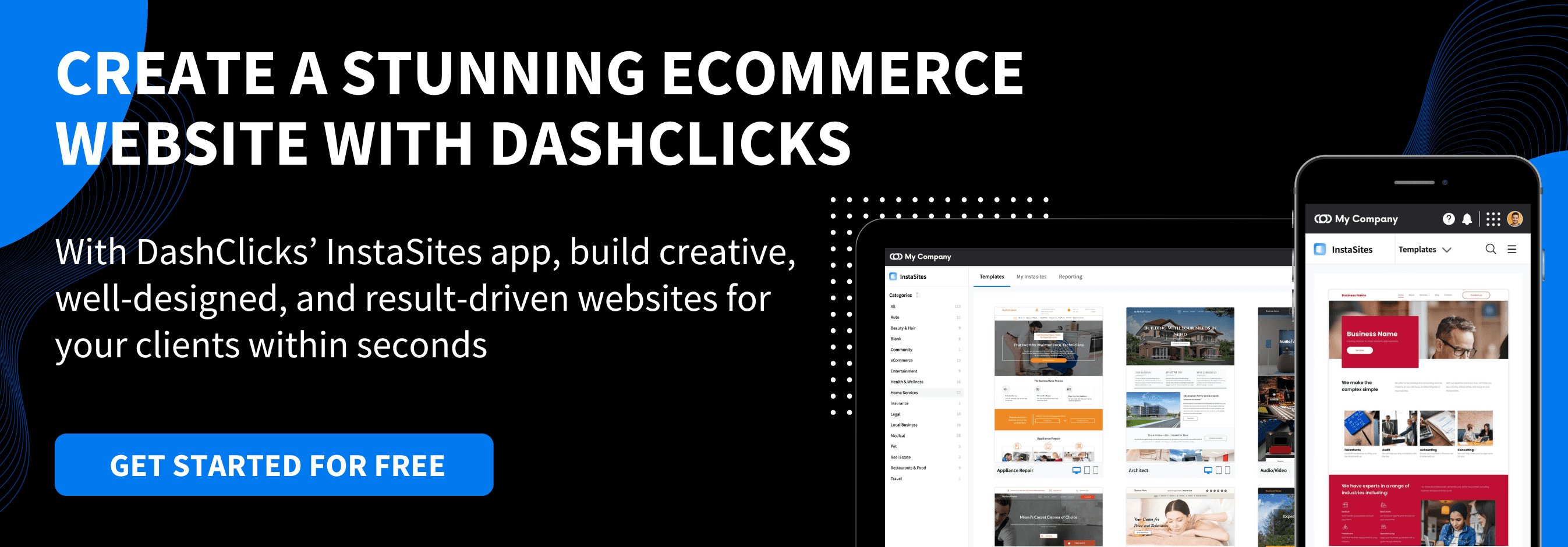
User-Friendly eCommerce Website: Cost, UX Trends, And Must-Have Features
A user-friendly eCommerce website isn’t just polished design—it’s the shortest path from first click → confident purchase → repeat customer. For MotoCMS readers (store owners, marketers, and SMB teams), the real decision usually comes down to this: launch fast with a template/site builder, or invest in custom development.
This guide breaks down what makes an online store genuinely easy to use: the UX trends shaping expectations today, the build mistakes that quietly hurt conversion, the non-negotiable features to prioritize, and the cost drivers you should plan for.
How Much Does a User-Friendly eCommerce Website Cost? (What Drives Price)
1. Hosted Builder vs. Self-Hosted eCommerce Site
The tradeoff is clear:
- Self-hosted offers more control, but you own maintenance, security, and ongoing development cost.
- Hosted reduces operational burden and can be ideal when speed-to-market matters. For teams choosing a hosted path, Shopify store design services generally include theme customization, UX layout, and brand setup.
Your best choice depends on internal resources, risk tolerance, and how quickly you need to ship.
2. Template-Based Launch vs. Custom eCommerce Development
- Templates help you launch faster with proven layouts and fewer UX mistakes.
- Custom development makes sense when you need unique purchase flows, deep integrations, or advanced performance work.
If you’re running (or moving toward) a Magento storefront and want a lighter, performance-focused front end, partnering with a Hyva theme development company can be a practical path to faster UX without rebuilding your entire stack.
3. Cost Drivers to Plan For
You don’t need a single “average cost” number to budget well. You need to understand what expands scope:
- Platform and hosting model (hosted vs. self-hosted responsibilities)
- Design complexity (template tweaks vs. custom components)
- Feature scope (filters, reviews, automations, multichannel feeds)
- Security and compliance (PCI, fraud tools, backups)
- Ongoing maintenance (updates, speed optimization, SEO/content)
4. Suggested Budget Tiers (Described, Not Priced)
- Starter MVP: browse-first taxonomy, strong PDPs, basic checkout/shipping, analytics
- Growth store: advanced filters, reviews/Q&A, automations, multichannel feeds
- Advanced: custom theme/performance engineering, integrations, scalable infrastructure, robust search (often via a third-party service)
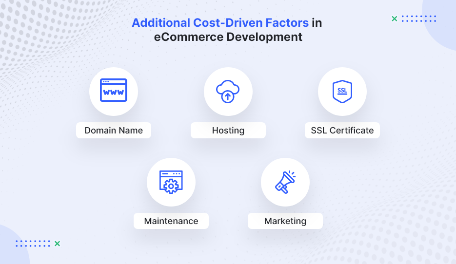
Image Source: WebMob
Start With the User: Audience Research That Shapes eCommerce UX
1. Define Your Audience, Products, and Goals Before Design
A practical way to prevent “pretty but hard to buy from” stores is to start with a simple chain: persona → UX decision. For example, if you sell quick meal solutions to busy professionals, your eCommerce UX should prioritize fast navigation, highlight prep time, and reduce checkout friction. To make this actionable, document:
- Top 3 customer goals (e.g., “find the right item fast,” “confirm delivery date,” “trust returns”)
- Top objections (price, fit/compatibility, shipping cost, legitimacy)
- Most common browsing pattern (category discovery vs. SKU search)
2. Build Browsing First (Especially for Small Catalogs)
A recurring lesson from early-stage marketplaces is that browsing often beats search when shoppers are exploring and don’t know what to type yet. For smaller, discovery-driven catalogs, a browsing-first experience can outperform search because it guides people toward decisions instead of asking them to already know what they want. Prioritize:
- Clear categories and collections
- Curated “new,” “best sellers,” and “giftable” paths
- Strong merchandising modules (related items, bundles, “complete the set”)
3. Taxonomy Is the Backbone of a User-Friendly Online Store
Your category structure isn’t a one-time menu decision—it’s a product that needs iteration. Teams regularly need multiple rounds of re-categorization before customers find it intuitive.
Practical taxonomy rules:
- Keep depth reasonable (avoid burying products under 5+ clicks)
- Add “shop by use case” paths (problem solved, recipient, compatibility)
- Use customer language—not internal jargon
- Validate labels with real shoppers (what they call it matters most)
eCommerce UX Trends That Make Stores Feel Effortless Right Now
1. Mobile-First eCommerce UX (Responsive by Default)
Mobile-first is no longer a trend—it’s the baseline. Responsive layouts should adapt naturally across devices, but “mobile-friendly” also means you design for thumbs and limited attention. Focus on:
- Thumb-friendly navigation and tap targets
- Fast-loading product detail pages (PDPs)
- Minimal checkout steps and fewer form fields
2. Site Speed and Reliability Are UX Features
Performance affects trust and conversion. Downtime loses sales, and slow pages increase bounce rate—plus poor speed can harm organic visibility. Treat performance like core UX:
- Compress images and avoid heavy scripts/apps
- Use a quality host and CDN when applicable
- Monitor uptime and page speed continuously (not only at launch)
3. Smarter Discovery: Browse + Filters, Then Efficient Search
A modern discovery roadmap tends to look like this:
- Nail taxonomy and browsing
- Add filters/sorting as the catalog grows
- Introduce search when complexity demands it
When search becomes necessary, many stores use third-party search services/APIs to reduce engineering time and avoid maintaining a full indexing stack in-house. Some businesses also enhance discovery using AI-driven search and recommendation engines developed through generative AI development services.
Core Features of a User-Friendly eCommerce Website (Non-Negotiables)
1. Navigation That Matches How People Shop
Navigation should reflect customer intent, not your org chart. Strong eCommerce navigation typically includes:
- Clear categories, breadcrumbs, and on-site pathways between products
- Sorting (price, popularity, newest)
- Filters (availability, size, rating, shipping speed)
If your platform supports it, add “related items” and “frequently bought together” to reduce dead ends and increase cart confidence.
2. Product Pages (PDPs) That Convert Without Friction
High-performing product pages reduce hesitation by answering questions early:
- Clear pricing, variants, and stock status
- Shipping and returns visibility before checkout
- Reviews, trust signals, and high-quality images/video
- Size guides/compatibility notes where relevant
3. Payments, Security, and Trust UX
Security is non-negotiable, but trust is also a UX problem. Customers need clarity and reassurance throughout checkout. Prioritize:
- Fraud prevention, backups, and proper payment security standards (e.g., PCI compliance for card processing)
- Transparent totals (shipping, taxes, fees) before the final step
- Clear confirmation emails and an easy refund/returns workflow
4. Shipping and Delivery UX
Shipping is part of the product experience. Make it easy to understand and hard to misinterpret:
- Delivery estimates, tracking, and local pickup (if relevant)
- Clear rules (free-shipping thresholds, regions, handling time)
- Upfront information on returns and exchanges
5. Back-Office Tools That Prevent Customer Pain
Operational issues quickly become common UX issues. Inventory errors, delayed fulfillment, and inconsistent listings create support tickets and lost trust.
Look for strong tools for:
- Inventory and order management
- Fulfillment workflows
- Promotions and email automation
- Multichannel selling readiness (marketplaces/social)
Biggest eCommerce UX Challenges (and How to Avoid Them)
1. Competing With Giants: Why Niche Stores Win on UX
Competing head-to-head with Amazon-style convenience is difficult. Niche stores win by offering a better decision experience:
- Specialized categories that match how buyers think
- Expert guidance, comparisons, and bundles
- Content that answers specific buyer questions (compatibility, sizing, use cases)
2. Overbuilding Too Early (Feature Bloat)
A common conversion killer is building complex features before you’ve validated customer behavior. Start with the smallest UX strategy that supports the core job: find → evaluate → purchase → receive.
What to do instead:
- Instrument key actions (PDP views, add-to-cart, checkout start, checkout completion)
- Improve the biggest drop-off point first
- Scale features only when customers prove they need them
3. Performance Issues (Speed + Hosting)
Speed problems often come from “death by a thousand add-ons.” Keep the stack lean and measure the impact of every extra script and widget.
How a Website Builder Software Helps Reduce eCommerce Complexity?
For many SMB teams, the biggest challenge isn’t choosing features, it’s managing the technical overhead behind them. Hosting setup, theme compatibility, plugin conflicts, performance optimization, analytics tools, and SEO integrations can quickly turn a simple store into a complicated stack.
This is where modern website builder software can help. Instead of assembling multiple tools, builders typically bundle core capabilities into one system, including:
- Hosting and infrastructure management
- Responsive templates optimized for eCommerce
- Built-in SEO settings and analytics tracking
- Drag-and-drop editing for faster page updates
- Security updates, backups, and performance monitoring
For smaller teams or first-time store owners, this reduces the need for ongoing developer support and shortens the time between idea and launch. It also makes it easier to test merchandising layouts, update product pages, and iterate on UX without rebuilding parts of the site.
Website builder software are often most useful when:
- Speed-to-launch matters more than deep customization
- The catalog is small to medium in size
- The team lacks in-house technical resources
- Ongoing maintainability is a priority
They may be less suitable for stores that require highly specialized integrations or complex backend workflows. But for many SMBs, a builder platform provides a practical middle ground between rigid templates and full custom development.
Reducing Technical Overhead with Unified Website Platform
For SMB teams that want to avoid stitching together hosting, design tools, plugins, analytics, and marketing integrations, all-in-one website ecosystems are becoming a practical alternative to traditional builds.
DashClicks’ Sites platform is one example of this approach. It combines a drag-and-drop website builder software, responsive templates, built-in eCommerce functionality, and integrated SEO tools in a single dashboard. Instead of managing multiple vendors for hosting, site edits, and optimization, teams can handle updates, product pages, and performance tracking from one place.
This kind of setup can be particularly useful when speed-to-launch and maintainability matter more than deep customization. For smaller catalogs or growing online stores, the ability to adjust layouts, add pages, and optimize content without developer support can reduce ongoing costs and allow faster iteration.
Platforms like this are typically best suited for:
- Small to mid-sized stores that need to launch quickly
- Teams without in-house developers
- Agencies managing multiple client websites
- Businesses that want built-in SEO and analytics rather than separate tools
They may be less ideal for stores requiring highly custom checkout flows, complex backend integrations, or unique front-end functionality, where custom development still provides more flexibility.
For many SMBs, though, DashClicks can offer a middle ground between rigid templates and fully custom builds, helping them launch faster while keeping their site easier to maintain over time.
Conclusion
A user-friendly eCommerce website is built, not decorated. The reliable formula is: audience research → strong taxonomy and browsing → trust and checkout fundamentals → mobile + speed → continuous iteration via feedback.
Start with the smallest set of features that makes shopping effortless, measure real behavior, and scale only what customers prove they need. That approach keeps your store fast, maintainable, and easier to market over the long term—exactly what SMB teams need to grow sustainably.

9 Essential Homepage Design Tips to Create the Perfect Website for Your Business
Your homepage is the digital front door to your business. It’s the first impression visitors have of your brand and plays a crucial role in converting casual browsers into loyal customers. According to studies, the average time users spend on a website page is between 52 and 54 seconds across all industries and page types. That's less than a minute to capture attention, communicate your value, and inspire action.
If you're wondering how to create a homepage that impresses and converts, look no further. Here, we’ll walk you through nine actionable homepage design tips, discuss why your homepage matters, and highlight the key elements every small business needs to include.
Why Your Homepage Design Matters?
Your homepage isn’t just a landing page; it’s your opportunity to guide visitors deeper into your site. It sets the tone for everything else users will interact with. For small businesses, where every visitor counts, the homepage plays a massive role in driving sales and engagement.
A well-designed homepage can increase engagement rates significantly. Studies report that websites with thoughtfully designed homepages see engagement rates climb from 60% to 75% as visitors continue browsing. The key? Prioritizing key design elements that resonate with your audience.
What to Include on Your Homepage?
To create a homepage that captivates your audience and supports conversions, here are some essential elements you must incorporate.
1. Compelling Business Introduction
Whenever users land on your homepage, they should immediately understand what your business does, how it benefits them, and why they should stay. The messaging should be clear, concise, and located right above the fold (the visible area before scrolling). This is your chance to make a strong first impression, so make it count.
Instead of using generic statements like "We offer solutions," try something specific and evocative that resonates with your audience. For example: “We deliver eco-friendly cleaning services in [city] that protect your family and the environment.” This tells users exactly what you do, where you operate, and why it matters to them.
Here is an example -

Pro Tip: Incorporate an engaging tagline that communicates your USP (unique selling point) instantly. A great tagline not only grabs attention but also makes your brand memorable. Test out different taglines to see what resonates with your target audience and drives action.
2. Accessible Contact Information
Don’t make users dig for ways to get in touch—it’s one of the quickest ways to lose a potential lead. Whether it’s a "Call Now" button, an email icon, or live chat access, make sure your contact options are visible and easy to use at all times.
Take it a step further by including clear CTAs like “Book Now” or “Shop Today” as sticky buttons that follow the user’s scroll. These ensure that no matter where a user is on your site, they can take action in an instant. For businesses that rely on appointments or calls, adding your phone number in the header can also further streamline communication.

Pro Tip: Highlight your contact options in multiple places, such as the top navigation bar, footer, and within your content. The easier you make it for users to reach you, the more likely they are to take the next step.
3. Simplified Navigation
A cluttered navigation menu can confuse users, slow them down, and cause them to leave your site altogether. To keep things simple, adopt visual hierarchy by prioritizing essential pages like "Services," "About Us," and "Contact." These should be easy to locate in your navigation bar, which should ideally be positioned at the top of the page.
If your website has a lot of content, consider grouping related pages under dropdown menus to reduce clutter. Each navigation item should clearly indicate what users can expect to find, avoiding vague terms like “More” or “Other.”
Did you know? Improving your navigation can also boost your SEO. Linking to core pages like your services or blog directly from your homepage helps search engines understand the structure of your site, which can result in better rankings. Additionally, a well-structured navigation menu improves user experience, keeping visitors on your site longer and reducing bounce rates.

Pro Tip: Conduct usability testing to ensure your navigation is intuitive. Ask a sample of users to find specific information on your website and use their feedback to fine-tune your menu structure.
4. Stunning, High-Quality Images
Visuals grab attention faster than text and leave a lasting impression on visitors. Investing in professional, high-resolution images that showcase your brand, services, or products is essential for making a strong first impression. If you run a service business, for example, feature compelling before-and-after photos that highlight the quality of your work. For product-based businesses, show detailed product shots and lifestyle images to help customers imagine using your offerings.
Avoid using generic stock images—they can feel impersonal and reduce trust. Visitors value authenticity, so include real photos of your team, workspace, or completed projects. Genuine visuals not only build credibility but also make your brand more relatable and human.
5. Persuasive Call-to-Actions (CTAs)
Your homepage should have a clear and compelling Call-To-Action that guides visitors toward specific actions, whether it’s signing up, making a purchase, or booking a consultation. Effective CTAs grab attention immediately and inspire action, helping visitors take the next logical step. Examples include:
- “Request a Quote”
- “Book a Free Consultation”
- “Shop Our Collections”
To maximize effectiveness, CTAs should:
- Be prominently displayed, ideally above the fold or in key areas of the page.
- Use strong, action-oriented words like "Get," "Try," "Book," or "Download."
- Align with what your audience is looking for or expects to do next.
What Makes a Good CTA? Short, two-to-four-word phrases work best for conversions. Phrases like "Get Started Now," "Claim Your Free Trial," or "Shop New Arrivals" perform better than longer or vague alternatives. Make them stand out by using contrasting colors, bold text, or eye-catching buttons.
Further Reading: 8 CTA Best Practices to Increase Conversions (+ Checklist and Power Words)
6. Keep It Mobile-Friendly
With 63.15% of all web traffic now coming from mobile devices, a homepage designed only for desktop users is a missed opportunity. A responsive website automatically adjusts its layout, images, and text to fit the visitor’s device, ensuring a flawless experience whether they’re using a smartphone, tablet, or desktop.
Key considerations for a mobile-friendly homepage include:
- Easy-to-read text without constant zooming or scrolling.
- Buttons and CTAs that are large enough for mobile users to click comfortably.
- Fast load times to accommodate mobile networks.
If you’re unsure where to start, use website builders like DashClicks’ white label drag and drop website builder or other platforms that prioritize mobile-friendly designs. A seamless mobile experience keeps visitors engaged and prevents them from bouncing to a competitor’s site.

Image Source: Business2Community
7. Fast Loading Speed
Page speed is critical for retaining visitors and boosting engagement. A slow-loading homepage can result in 50% higher bounce rates, meaning visitors leave before interacting with your content. Modern users expect websites to load quickly, with studies showing that pages loading in under 2 seconds achieve 3x higher conversion rates compared to slower ones.
To optimize your load time:
- Compress large images to reduce file sizes without sacrificing quality.
- Minimize large animations and videos that can slow your site down.
- Leverage browser caching to reduce loading times for returning users.
Remember, even a one-second delay in loading can result in a noticeable drop in engagement and revenue. Prioritizing speed ensures visitors stay longer and are more likely to convert. If you need expert help improving your website speed and overall performance, you can explore website design services to understand how modern design and engineering practices can make your site faster and more user friendly.
8. Minimalist Layout for Better Focus
When it comes to homepage design, less is truly more. A cluttered page can overwhelm visitors, making it difficult for them to focus on what matters. A minimalist design uses structured layouts, clean fonts, and plenty of white space to emphasize your key elements, like images, headlines, and CTAs.
White space isn’t wasted space—it creates breathing room that helps users focus on your content. In fact, research shows that pages with well-structured whitespace around content improve readability and comprehension by 20%.

A clean, streamlined design helps guide visitors naturally through your homepage, making it easier for them to find what they need and take action efficiently.
9. SEO-Optimized Headings
Headings are more than just visual elements—they’re essential for both user navigation and search engine optimization (SEO). Every homepage should include one H1 tag that communicates the main focus of the page, such as your brand name or a primary keyword related to your product or service.
Use smaller headings, such as H2s and H3s, to create a clear hierarchy and structure. For example, H2s can introduce major sections of your homepage, while H3s can provide more detailed subpoints. This not only improves readability for users but also helps search engines understand your content, making it easier for your page to rank higher in search results.
Avoid using multiple H1 tags, as this can confuse search algorithms. Instead, focus on crafting concise, keyword-rich headings that guide readers and optimize your homepage for search engines. Thoughtfully designed headings can drive both engagement and traffic, providing a win-win for your site.
Homepage Design Best Practices
Now that we’ve covered essential homepage elements, here are some extra tips to elevate the user experience:
- Strong Branding: Consistency is key. Use your site's color palette, logo, and fonts across all pages to reinforce your identity.
- FAQs Section: Answer common questions directly on your homepage to keep visitors informed and engaged. This also keeps them on your site longer.
- Social Proof: Add testimonials, reviews, or client logos to build instant trust.
Avoid These Common Homepage Design Mistakes
While designing a homepage can be exciting, there are a few common pitfalls you’ll want to dodge to ensure your site delivers the best possible experience. Here’s what to watch out for:
- Cluttered Layout: Too many elements crammed onto the homepage can overwhelm visitors and make your site feel chaotic. Keep it clean and organized with sufficient white space to guide the user's eye to important sections without distraction. A clear structure improves navigation and retains visitor attention.
- Slow Loading Speed: A slow-loading homepage can cost you visitors in mere seconds. If your site takes too long to load, users are likely to bounce before even seeing what you offer. Optimize images, compress files, and leverage caching techniques to keep your site snappy.
- Lack of a Clear Call-to-Action (CTA): Your visitors need direction! A missing or vague CTA can leave users uncertain about their next step. Make your CTA prominent, specific, and action-oriented to encourage conversions, whether it’s signing up, purchasing, or learning more.
- Ignoring Mobile Responsiveness: With over half of web traffic coming from mobile devices, an unresponsive homepage means lost potential. Ensure your design adapts seamlessly to different screen sizes, offering a smooth experience whether users are on phones, tablets, or desktops.
- Poor Use of Visuals: Low-quality images or irrelevant graphics can cheapen your brand and confuse visitors. Choose high-resolution visuals that align with your messaging and make an impact. Every image should add value and enhance the overall design.
- Overloading With Text: While content is essential, a text-heavy homepage can deter readers. Avoid overwhelming blocks of text by incorporating bullet points, headlines, and visuals to break up information and maintain readability.
Avoiding these missteps will help you create a homepage that stands out, engages your audience, and drives results!
Some design flaws can reduce engagement and drive users away. Watch out for these pitfalls:
- Cluttered aesthetics
- Vague or excessive text
- Lack of clear next steps
- Ignoring page load times
Examples of Exceptional Homepage Design That Drive Engagement
Here are some real-life examples of good homepage designs that effectively balance aesthetics, functionality, and user experience:
- Apple (apple.com): Apple's homepage is a masterclass in minimalism and focus. It uses clean visuals, minimal text, and sharp product images to draw attention to its latest offerings. The calls-to-action are clear and direct, guiding users seamlessly through the site.
- Airbnb (airbnb.com): Airbnb’s homepage excels in intuitive navigation and customization. It greets users with a search bar and personalized suggestions, prioritizing user needs. High-quality imagery sets the perfect tone for travel inspiration.
- Dropbox (dropbox.com): Dropbox uses a simple layout with clear messaging to communicate its core value. The homepage prominently displays a call-to-action button and a brief explanation of the service, making it easy for users to understand and act.
- Spotify (spotify.com): Spotify’s homepage leverages bold colors, dynamic visuals, and concise copy to create an energetic and engaging experience. The site emphasizes free trials and premium upgrades with clearly placed buttons.
These examples all demonstrate how thoughtful design can create engaging homepages that captivate users and drive conversions.
Build High-Performing Websites Effortlessly With DashClicks
DashClicks’ website builder software offers an intuitive and powerful solution for creating high-performing websites. Here’s what elevates DashClicks’ Site software:
- Responsive Designs: Your website will look great and function perfectly on any device, whether it’s a phone, tablet, or desktop, ensuring a seamless user experience.
- SEO Tools: Optimize your site effortlessly with built-in tools that help improve search rankings, driving more organic traffic to your website.
- Built-In E-commerce Platform: Sell products or services directly from your site with a fully integrated e-commerce platform, making online transactions simple and efficient.
- Fast Loading Speeds: Keep your visitors engaged with lightning-fast page loading times, reducing bounce rates and improving overall performance.
- Global Branding Control: Easily maintain a consistent brand identity across all pages of your website with centralized branding tools.
- Website Analytics: Track your website's performance with detailed analytics, giving you insights into visitor behavior, traffic sources, and more to optimize your strategy.
By using software, you can avoid common design pitfalls and build a homepage that captivates your audience and drives measurable results.
Building the Perfect Homepage Is Easier Than You Think
Your homepage isn’t just a page; it’s a strategic tool to grow your business. By implementing these homepage design tips, you can create a stunning online presence that drives traffic, converts visitors, and builds long-term loyalty.
Take the next step toward your dream homepage today!


A Guide to Responsive Web Design What It Is and How To Use It
Web design is no longer a one-size-fits-all endeavor. With so many devices—from smartphones to desktops to tablets—users expect websites to work seamlessly no matter how they're accessed. Enter responsive web design, the ultimate solution for creating websites that adapt dynamically to any screen size or device type.
If you're a developer, designer, or business owner, this comprehensive guide will teach you everything you need to know about responsive web design.
We’ll cover foundational concepts, frameworks, best practices, performance tracking, and even how AI is revolutionizing the space.
What Is Responsive Web Design?
Responsive web design (RWD) is an approach to creating websites that automatically adjust layout, images, and functionality to provide an optimal viewing experience across devices. This means no pinching, zooming, or horizontal scrolling—just a hassle-free interface that's clean and easy to use.
The term was first coined by Ethan Marcotte in 2010, and it remains a game changer in the industry. The principles of RWD focus on flexible grids, fluid images, and media queries to tailor a design's elements based on the user’s screen dimensions.
Why Does Responsive Web Design Matter?
- Mobile Usage is Booming: Over 60% of all website traffic now comes from mobile devices, and the number keeps growing.
- SEO Benefits: Google prioritizes mobile-friendly sites, and responsive design helps boost search rankings.
- Enhanced User Experience: A responsive website keeps users engaged, lowers bounce rates, and increases website conversions.
- Cost Efficiency: Instead of building separate sites for desktop and mobile, responsive design handles both in one build.
The 3 Key Frameworks That Power Responsive Design
Responsive design often relies on specific frameworks to streamline the development process. Here are three foundational types that every web developer should know:
1. Fluid Grid Systems
Fluid grids use percentages instead of fixed measurements to define layout components. This ensures that elements resize proportionally regardless of screen size. All website design grids, no matter their size or complexity, share specific components that define them as grid layouts:

Image Source: Crazy Themes
For instance: Instead of defining a container as "400px wide," you might set it as "40%," making the container relative to the viewport width.
2. Flexible Images
Images in a responsive layout are scaled or cropped dynamically to prevent them from breaking the layout.

Here's how flexible images work:
Max-Width Property: Images set to 'max-width: 100%' scale smoothly depending on their container.
3. Media Queries
Media queries are at the heart of CSS-based responsive design. They allow designers to apply styles conditionally based on screen size, orientation, and resolution.

Image Source: Medium
For instance:
'''
@media (max-width: 768px) {
body {
font-size: 14px;
}
}
'''
Frameworks That Make Life Easier: Platforms like Bootstrap, Foundation, and Tailwind CSS provide pre-designed responsive components, saving significant development time.
Ensuring Websites Are Truly Responsive
Building a responsive site isn’t just about following frameworks and guidelines—it's about comprehensive testing to ensure a flawless user experience. Here’s how you can guarantee that your website is truly responsive:
1. Use Browser Developer Tools
Modern browsers like Chrome and Firefox come with built-in developer tools that allow you to preview your website on a variety of screen sizes and devices. Simply open the Developer Tools, navigate to the responsive design view, and test how your site adapts to different resolutions. This is a quick and easy way to identify any layout issues early on.
2. Test On Real Devices
While simulators and emulators are useful, they can't fully replicate the experience of using a site on an actual device. Test your website on real phones, tablets, and desktops to catch device-specific quirks. If you don’t have access to multiple devices, consider borrowing from friends or family or using platforms like LambdaTest or BrowserStack, which offer remote access to a wide range of devices for cross-device testing.

Image Source: QAwerk
3. Audit Speed and Load Time
Even the most beautifully responsive design is ineffective if your site loads too slowly. Speed is critical for user experience and SEO. Use tools like Google PageSpeed Insights or GTmetrix to analyze your site's performance and pinpoint issues like large image files, poorly optimized code, or uncompressed assets. Make sure your site responds quickly across all devices, especially mobile, where users are more likely to abandon slow-loading pages.
4. Don’t Forget Accessibility
A truly responsive site must also cater to users with disabilities. Ensure your site is accessible by following guidelines like the WCAG (Web Content Accessibility Guidelines). Tools like WAVE, Axe, or Lighthouse can help you test for issues such as proper color contrast, screen reader compatibility, and keyboard navigation. Addressing accessibility ensures a better experience for all users and broadens your audience reach.
5. Test Across Browsers
Responsive design isn’t just about device compatibility—it’s also about making sure your site works well across different browsers. Test your site on Chrome, Firefox, Safari, Edge, and others to ensure consistent functionality and appearance. Sometimes, browser-specific quirks can affect layout or performance, so don’t skip this testing step.
6. Gather User Feedback
Once your site is live, consider collecting feedback from real users to identify any pain points or areas for improvement. User testing can provide insights you might miss during development and highlight adjustments needed to optimize the responsive experience further.
Best Practices for Designing Responsively
Crafting a stellar responsive site requires more than technical know-how. It’s about balancing functionality with aesthetics while keeping the user experience front and center.
1. Start With a Mobile-First Approach
When creating a responsive design, always design for the smallest screen first, such as smartphones. This allows you to focus on the core features and functionality essential for your site. Once the mobile experience is perfected, you can scale upward to enhance the design for larger devices like tablets and desktops. This ensures a solid foundation for all users, regardless of their screen size.
2. Prioritize Speed Optimization
Fast-loading pages are critical for user satisfaction and SEO rankings. Optimize your images by compressing them without losing quality, and use tools to minimize CSS, JavaScript, and HTML files. Reduce the number of HTTP requests by combining resources where possible. The goal is to have every page load in under three seconds, as even a slight delay can lead to higher bounce rates and lost visitors. In addition to on-site optimizations, leveraging Local Citation Services can enhance your site’s visibility in local search results, complementing technical performance with stronger local SEO presence.
3. Implement Flexible Typography
Typography should adapt to different screen sizes for readability. Use relative units like 'em' or 'rem' for font sizes rather than fixed values. This ensures that text scales proportionally and remains legible on devices of all sizes. Additionally, consider line height and spacing to improve the reading experience on both small and large screens.
4. Design for Thumbs
Make touch interactions easy and intuitive by designing with thumbs in mind. Buttons, links, and other interactive elements should be large enough to tap comfortably without requiring precision. Place key touchpoints within easy reach, especially in the lower portion of the screen, where thumbs naturally rest when holding a phone.
5. Focus on Breakpoints
Don’t rely on device-specific breakpoints, as new devices with varying screen sizes are constantly being released. Instead, establish logical breakpoints based on your content and layout needs. Common breakpoints include 480px for smartphones, 768px for tablets, and 1200px for desktops. This ensures your design adapts fluidly to any screen size, present or future.
6. Simplify Navigation
Navigation is one of the most critical components of responsive design, especially on smaller screens. Use collapsible menus or hamburger icons to keep the interface clean while still providing easy access to key pages. Ensure that menu items are clearly labeled and easy to tap, and prioritize essential navigation options to avoid clutter.
7. Test Responsiveness Often
Responsive design is an ongoing process, and regular testing is vital to maintaining a great user experience. Test your site on a variety of devices, including smartphones, tablets, and desktops, to ensure it functions seamlessly across all platforms. For more complex projects, collaborating with a web design company can help identify edge cases—such as very small or very large screens—and address potential issues before they affect users. Tools like browser developer consoles and online testing platforms can help streamline this process.
8. Consider Context and User Behavior
Responsive design isn’t just about screen size—it’s also about understanding how people use your site on different devices. Mobile users may need quick access to specific features, like contact information or directions, while desktop users may focus more on in-depth browsing. Tailor your design to meet the needs and behaviors of your audience across all platforms.
9. Use Scalable Media
Images, videos, and other media should be flexible to adapt to different screen dimensions. Use responsive images with the `srcset` attribute to serve appropriately sized files based on the user’s device. For videos, opt for responsive players that adjust to fit the screen without distorting the content. This ensures media looks great without negatively impacting load times.
10. Emphasize Consistency Across Devices
While your design should adapt to various screen sizes, it’s important to maintain a consistent look and feel across all devices. Use a coherent color scheme, typography, and branding elements so users recognize your site, whether they’re browsing on mobile, tablet, or desktop. Consistency builds trust and enhances the overall user experience.

Image Source:
Measuring the Success of Your Responsive Design
Building a responsive website is an achievement, but how do you know it’s truly successful? Measuring the success of your responsive design involves analyzing several key metrics and using various tools to ensure that your website is performing optimally across all devices. Below, we’ll explore detailed steps and tools you can use to evaluate the effectiveness of your responsive site.
1. Analyze Traffic and User Behavior With Google Analytics
Google Analytics is a powerful tool for tracking how users interact with your site on different devices. Here’s how to leverage it for responsive design:
- Step 1: Navigate to the “Audience” section and select “Mobile > Overview.” This will show you a breakdown of traffic by device category (desktop, mobile, tablet).
- Step 2: Check metrics like bounce rate, pages per session, and average session duration for different devices. A high bounce rate on mobile, for example, could signal a design issue specific to smartphones.
- Step 3: Use the “Device” report (under “Mobile”) to dig deeper into specific device models. This helps identify if certain devices consistently have performance or usability problems.
2. Test Performance With Google PageSpeed Insights
Page speed is a critical factor in user experience and search engine rankings. Google PageSpeed Insights assesses how well your design performs on both mobile and desktop.
- Step 1: Enter your website’s URL into the tool.
- Step 2: Review the scores for mobile and desktop performance. Note that mobile scores may differ due to network limitations and smaller device memory.
- Step 3: Address the recommendations provided, such as optimizing images, enabling compression, and reducing render-blocking resources (e.g., JavaScript or CSS).

3. Monitor Responsiveness With BrowserStack
BrowserStack is a testing tool that lets you check how your website looks and functions on a variety of devices and browsers.
- Step 1: Log in to BrowserStack and select “Live Testing.”
- Step 2: Choose from dozens of device and browser combinations to preview your site.
- Step 3: Test functionality, layout, and navigation to ensure everything works seamlessly regardless of the device or browser.

4. Track Conversion Rates on Different Devices
Monitoring conversion rates is essential to measure the success of your responsive design. Whether it's filling out a form, making a purchase, or signing up for a newsletter, analyzing how conversions perform across devices will provide insights.
- Step 1: Set up conversion tracking in Google Analytics or your analytics tool of choice.
- Step 2: Segment conversion data by device category to determine if users on mobile or tablets are converting at lower rates than expected.
- Step 3: If conversion rates differ significantly between devices, revisit your design to address usability or functionality issues.
5. Use Heatmaps With Tools Like Hotjar or Crazy Egg
Heatmaps visually display where users click, scroll, or spend time on your website. These insights can highlight design elements that are working—or failing—on specific devices.
- Step 1: Install a heatmapping tool like Hotjar or Crazy Egg on your website.
- Step 2: Collect data from users over several weeks to identify behavior patterns.
- Step 3: Compare heatmaps for mobile and desktop users. For example, if mobile users struggle to tap certain buttons, your design may need adjustments like increasing tappable areas.
6. Validate Accessibility With Axe or Lighthouse
Accessibility is critical for responsive sites, allowing users of all abilities to engage easily with your content. Tools like Axe or Lighthouse can automate accessibility testing.
- Step 1: Run an audit using Axe or the Lighthouse feature within Chrome DevTools.
- Step 2: Pay attention to accessibility issues such as missing alt text for images, improper use of ARIA roles, or insufficient contrast ratios.
- Step 3: Fix identified problems to ensure your website complies with WCAG guidelines while maintaining responsiveness.

7. Conduct User Testing With Real Feedback
No matter how advanced testing tools are, nothing replaces feedback from real users. Conduct user testing to identify pain points and areas of success across devices.
- Step 1: Gather a diverse group of users who access your site on different devices.
- Step 2: Ask them to complete specific tasks, such as finding information or completing a purchase.
- Step 3: Observe their behavior and note any struggles or comments regarding the responsiveness of the site.
By following these steps and utilizing these tools, you’ll be able to measure the success of your responsive design in a comprehensive, data-driven way. Responsive design isn’t just about adjusting layouts for different screens—it’s about delivering an exceptional experience for every user, every time.
How AI Is Revolutionizing Responsive Web Design?
Artificial Intelligence (AI) is taking responsive design to the next level by automating tasks and delivering hyper-personalized experiences.
1. Automated Design Assistance
AI-powered platforms like Wix ADI or Sketch’s plugin ecosystem are revolutionizing the way designers work by creating wireframes and responsive layouts in minutes. These tools remove much of the manual effort, allowing designers to focus on creativity and strategy instead of repetitive tasks. Partnering with an AI design company can take this even further by building custom AI-driven workflows tailored to specific project needs. By automating the initial stages of design, they also significantly speed up project timelines.
2. Personalized UI Adjustments
AI-driven systems analyze user behavior, such as click patterns and browsing habits, to dynamically adjust layouts and elements in real-time. This ensures that users are presented with interfaces tailored to their needs and preferences, ultimately enhancing the overall user experience. These personalized adjustments can lead to higher engagement, improved usability, and more satisfied users.
3. Predictive Image Optimization
Machine learning algorithms are now capable of predicting the best image resolution, format, and size for different devices. This ensures optimal performance without sacrificing image quality.
By balancing visual appeal with performance requirements, AI-driven image optimization helps websites and applications load faster, reduces bandwidth usage, and provides a seamless experience for users across various platforms.
Further Reading: Optimizing Your Images for Better Search Results
Build Responsive Websites With Website Builder
For businesses and individuals looking to create stunning, fully responsive websites with ease, white label drag and drop website builder software by DashClicks offers an outstanding solution. Powered by an intuitive drag-and-drop interface, this software simplifies the website-building process, allowing users to design professional, mobile-friendly websites without needing advanced coding skills.
The software prioritizes responsiveness, ensuring your website looks and functions flawlessly across all devices, including smartphones, tablets, and desktops. With pre-designed templates optimized for modern audiences, you can kickstart your website design in minutes. Additionally, the tool incorporates flexible media capabilities and scalable elements, so your visuals are crisp and adaptive regardless of screen size.
Enhance Website Optimization With SEO Services
Beyond creating responsive websites, optimizing them for search engines is critical for online visibility and success. DashClicks’ white label SEO services are designed to help your website achieve higher rankings, drive organic traffic, and convert visitors into customers. By leveraging advanced keyword research, on-page optimization, and technical SEO strategies, DashClicks ensures that your website is not only mobile-friendly but also search-engine-friendly.
With tools and techniques that improve website speed, metadata, and content relevance, DashClicks can enhance your site’s performance across all devices. The integration of local SEO strategies also boosts visibility for businesses targeting specific geographic areas. Combine your responsive design with DashClicks SEO services to create a powerful online presence that attracts and engages users while delivering measurable results.
Stay Ahead of the Curve With Forward-Looking Design Strategies
Responsive web design is no longer optional—it’s an essential strategy for businesses of all sizes. Implementing responsive strategies keeps your site competitive, engaging, and adaptable to emerging trends.
Looking ahead, responsive designs will evolve to cater to new device types like foldable phones or AR/VR interfaces. Staying educated and adaptable will ensure your designs remain relevant.


10 Web Design Mistakes Costing You Conversions and How to Fix Them
When it comes to creating a website that's both beautiful and effective, even small mistakes can have big consequences. Did you know that poor website design can drastically reduce your conversion rates?
In this post, we'll explore common web design mistakes that hurt your business and how you can fix them. Whether you're a business owner or a designer, you'll find these insights invaluable.
Why Does Web Design Matter?
Web design is a critical factor in shaping the user experience and can determine whether visitors stay on your website or leave in a matter of seconds. A well-designed website not only attracts users but also guides them through a seamless journey, making it easier for them to find the information or products they seek.
First impressions are powerful; an intuitive and aesthetically pleasing design can instill a sense of credibility and trustworthiness. Furthermore, effective web design enhances accessibility, ensuring that visitors of all abilities can navigate the site effortlessly.
Thus, investing in thoughtful web design is essential for retaining visitors, boosting engagement, and ultimately increasing conversions.
Mistake 1: Using CTA Colors That Blend In
Call-to-action (CTAs) are essential elements on any webpage. They serve as the guiding force for your visitors, directing them toward taking the desired action—whether it's signing up for a newsletter, making a purchase, or downloading a valuable resource. However, if your CTA buttons blend in with the rest of your design, they become easy to overlook, diminishing their effectiveness and potentially leading to lost conversions.
The Solution
Choose contrasting colors for your CTA buttons to ensure they capture attention. For instance, if your website’s primary color is blue, consider using a bright orange or bold red for your CTA buttons. This contrast not only makes your CTAs stand out but also enhances their visibility against your overall design. Additionally, think about the emotional response associated with colors; vibrant hues can evoke enthusiasm and urgency, prompting users to click.
Remember, the goal is to create a visual hierarchy that clearly guides your visitors' eyes to the most important actions you want them to take. By using a thoughtful color strategy, you can significantly improve user engagement and drive conversions.
Mistake 2: Making Buttons That Are Too Small – Or Too Big
Buttons that are too small can be challenging to click, particularly on mobile devices where precision is often compromised. Users might find themselves frustrated, leading to a negative experience on your site.
On the other hand, buttons that are excessively large can disrupt the visual harmony of your webpage, making the design feel cluttered and unprofessional. This imbalance can detract from the overall user experience and may even discourage visitors from engaging with your content.
The Solution
To avoid these pitfalls, ensure that your buttons are of an appropriate size. They should be comfortably clickable for users without overwhelming the other elements present on your page. A good rule of thumb is to make buttons at least 44x44 pixels, which is the minimum recommended size for touchscreens.
Additionally, consider the context in which your buttons are used—if they're likely to be clicked frequently, you may want to err on the side of slightly larger sizes for enhanced usability. Balancing size with aesthetics is key to creating an inviting and effective user interface.

Mistake 3: Ignoring Your Audience’s Color Preference
Color psychology plays a significant role in consumer behavior, as colors can profoundly influence emotions and perceptions. Different colors can evoke various emotional responses; for instance, red often conveys excitement and urgency, while blue can evoke feelings of trust and calmness. Ignoring the colors that resonate with your target audience can lead to missed opportunities and potentially cost you valuable conversions.
The Solution
To avoid this pitfall, it's crucial to conduct thorough market research to gain insights into your audience's color preferences. This can be achieved through surveys, focus groups, or analyzing competitors who successfully engage a similar demographic. If you're targeting a youthful audience, vibrant and energetic colors like red, yellow, or bright green might work best, as they can capture attention and create a sense of enthusiasm.
Conversely, for a more professional audience, it's wise to opt for calm and neutral tones such as blue, gray, or even muted earth tones, which evoke a sense of reliability and sophistication. By aligning your color choices with your audience's preferences, you can enhance user engagement and drive higher conversion rates.
Mistake 4: Not Optimizing for User Flow
A website that doesn’t prioritize user flow can leave visitors feeling confused and frustrated, ultimately resulting in lost conversions and opportunities. Poor user flow often arises from complicated navigation systems and an unclear hierarchy of information, which can make it difficult for users to find what they need. When users encounter obstacles in their browsing experience, they're more likely to abandon the site altogether, leading to a higher bounce rate.
The Solution
To enhance user flow, it's crucial to create a navigation structure that is both clear and intuitive. This involves employing breadcrumb navigation so users can easily track their path, using header tags to categorize content effectively, and maintaining a logical flow of information that guides visitors seamlessly from one section to another. Each page should have a distinct purpose, serving as a stepping stone that leads the visitor toward taking meaningful action.
Additionally, consider conducting user testing to identify any pain points in the navigation experience and make necessary adjustments based on real feedback. By focusing on a well-optimized user flow, you can significantly improve user satisfaction and conversion rates.
Mistake 5: Forgetting Trust Factors to Boost Your Credibility
Trust factors such as testimonials, certifications, and privacy policies play a crucial role in influencing a visitor's decision to convert into a customer. These elements help establish a sense of reliability and security, which is essential in today’s digital landscape.
When a potential customer visits your site, they are often assessing whether they can trust your brand with their information and their purchasing decisions. Neglecting these critical components can make your website appear untrustworthy, leading to higher bounce rates and lost sales opportunities.
The Solution
To effectively enhance your site's credibility, prominently feature testimonials from satisfied customers that highlight their positive experiences with your products or services.
Incorporate detailed case studies that showcase successful outcomes and demonstrate the value you provide. Additionally, display trust badges and certifications from reputable organizations to enhance your credibility further.
It's also vital to clearly present security seals and comprehensive privacy policies to reassure visitors that their personal information is safe and confidential. This transparency can significantly alleviate any concerns potential customers may have about data security.
By strategically integrating these trust factors into your website, you not only build credibility but also create a more inviting atmosphere that encourages visitors to complete their purchases, ultimately leading to increased conversions.
Mistake 6: Overloading With Too Much Text
One common mistake many website owners make is presenting large blocks of text that can overwhelm visitors. When users encounter dense paragraphs, they often feel daunted and may choose to leave rather than engage with the content.
Not only does this overload of information make your website appear cluttered, but it also detracts significantly from the overall user experience. It's crucial to remember that visitors are usually looking for quick, easily digestible information, and long text-heavy sections can hinder their ability to find what they need.
The Solution
To enhance readability and keep your audience engaged, break up your text into smaller, more manageable paragraphs. This approach allows readers to process information more easily. Additionally, consider using bullet points or numbered lists to highlight key takeaways or steps, which can make your content more accessible.

Incorporating clear headings and subheadings will help to organize your material effectively, allowing users to scan through the content quickly and find the information they are interested in. By applying these strategies, you can create a more inviting and user-friendly website that encourages visitors to stay longer and explore further.
Mistake 7: Slow Loading Times
Website loading speed is a critical factor for user experience and SEO. A slow-loading website can frustrate users, leading them to abandon your site before it even fully loads. In fact, studies have shown that even a one-second delay in loading time can result in a significant drop in conversions and user satisfaction. This can negatively impact not just your bounce rates but also your overall brand reputation.
The Solution
To combat slow loading times, start by optimizing your images. Large, uncompressed images can drastically slow down your site, so use image compression tools to reduce file sizes without sacrificing quality. Additionally, leverage browser caching, which allows browsers to store certain elements of your site, reducing load times for returning visitors. It's also essential to minimize the number of HTTP requests by consolidating files, such as CSS and JavaScript, where possible.
Furthermore, consider using a content delivery network (CDN). A CDN distributes your website's content across multiple servers located around the globe, ensuring that visitors access your site from the server closest to them.
This can significantly speed up loading times for users, regardless of their geographic location, enhancing their overall experience and increasing the likelihood of them staying on your site. By implementing these strategies, you can increase website performance and keep users engaged.
Mistake 8: Poor Mobile Optimization
In today's digital landscape, it's crucial to recognize that more than half of all web traffic originates from mobile devices. A website that isn’t optimized for mobile can miss out on a substantial number of potential conversions and customer engagement opportunities. Users expect seamless access to information and services on their smartphones and tablets, and a poor mobile experience can lead to frustration, resulting in lost visitors and revenue.
The Solution
To address this issue, implement responsive design techniques that ensure your site not only looks visually appealing but also functions smoothly across all devices, regardless of screen size. This involves flexible grid layouts, adaptable images, and CSS media queries that adjust the content dynamically.
Additionally, it’s essential to regularly test your website on a variety of mobile devices and browsers to identify and rectify any issues that may hinder user experience. By prioritizing mobile optimization, you can create a seamless experience that keeps users engaged and encourages conversions.
Further Reading: Mobile Website Design: Important Things You Need to Know
Mistake 9: Inconsistent Branding
Inconsistent branding can confuse visitors and dilute your brand's identity, ultimately making it harder for them to connect with your business. When a brand lacks cohesion, potential customers may struggle to understand what your business stands for, leading to a lack of trust and recognition in a crowded marketplace.
The Solution
To combat this issue, maintain consistent branding across all elements of your website. This includes using the same color scheme, fonts, and imagery throughout your pages. Additionally, ensure that your messaging aligns with your brand's voice and values.
Consistency not only helps reinforce brand recognition but also builds trust with your audience, making it easier for them to engage with your business and remember your brand in the future. By creating a unified brand experience, you encourage deeper connections and loyalty from your visitors.

Image Source: IMM
Mistake 10: Lack of Clear Value Proposition
A clear value proposition is crucial for effectively communicating what makes your product or service unique and why potential customers should choose you over your competitors.
It serves as a persuasive statement that highlights the distinctive benefits your offering provides, helping to capture the attention of visitors. Without a well-defined value proposition, visitors may feel confused or indifferent, leading them to leave your site without taking any action, ultimately affecting your conversion rates.
The Solution
To address this, take the time to craft a compelling value proposition that resonates with your target audience. This statement should articulate not just what you offer, but also how it addresses the specific needs and pain points of your customers. Place your value proposition prominently on your homepage and landing pages, ensuring it stands out visually.
Use clear, concise language that emphasizes the benefits and unique selling points of your product or service. Additionally, consider incorporating testimonials or case studies that reinforce your claims, further establishing credibility and encouraging visitors to engage with your brand.
The Role of DashClicks’ White Label SEO Services in Enhancing User Experience
DashClicks’ white label SEO services offer comprehensive solutions that can significantly improve user experience on your website. By optimizing your site's structure, content, and performance, DashClicks helps ensure that visitors find what they're looking for quickly and efficiently.
Their SEO strategies, including keyword optimization, meta tag enhancements, and site speed improvements, contribute to a smoother navigational experience. Additionally, with a focus on local SEO and mobile optimization, DashClicks aims to make sure your site is accessible and navigable across various devices and locations.
By employing white label SEO fulfillment services, you not only drive more targeted traffic to your site but also create a more engaging and satisfying experience for your users, ultimately leading to higher conversions and customer retention.
Conclusion
In summary, avoiding these common website design mistakes can significantly improve your website's conversion rate. By focusing on clear CTAs, mobile optimization, user flow, and trust factors, you can create a website that not only looks great but also drives conversions.
Ready to take your web design to the next level? Start by implementing these tips and watch your conversions soar. If you need professional help, our team of experts is here to assist you.


Boost Your Website's Performance With These Speed Hacks
In the digital age, speed is everything. Whether you're running an e-commerce site or a personal blog, the speed of your website can make or break visitor engagement. Slow websites frustrate users and can lead to high bounce rates, which negatively impacts SEO and overall user experience.
This blog post aims to provide you with eight quick and effective ways to increase your website speed. By the end of this read, you'll have actionable tips to enhance your website's performance, ensuring a seamless and enjoyable experience for your visitors.
What Is Website Speed?
Website speed refers to how quickly web pages load and display in a user's browser. It encompasses various metrics, including initial load time, interactivity, and visual stability. Essentially, it's the time it takes for your website's content to appear and become usable.
Components of Website Speed
Understanding the components that contribute to website speed is crucial for identifying areas for improvement. Here are the key elements:
- Initial Load Time: Initial load time is the duration it takes for the first elements of a web page to become visible in the user's browser. It starts when a user enters your URL and ends when key content loads. Factors influencing this include server response time, file sizes, and the complexity of HTML/CSS/JavaScript code. Optimizing images and leveraging browser caching can significantly reduce initial load times.
- Time to First Byte (TTFB): Time to First Byte measures the time between the user's request for a web page and the moment the browser receives the first byte of data from your server. This metric reflects server performance and the efficiency of back-end processes. A low TTFB indicates a responsive server, while a high TTFB can indicate server issues or poorly optimized back-end code.
- Page Rendering Speed: Page rendering speed refers to how quickly a user's browser can construct and display a web page once the resources are loaded. This process involves executing JavaScript, parsing HTML, and rendering images and styles. Ensuring that your JavaScript is as efficient as possible—by minifying files and deferring loading when appropriate—can enhance rendering speed and provide a better user experience.
- Visual Stability: Visual stability pertains to how consistently the elements of a web page load without causing layout shifts. Sudden changes in the layout as content loads can confuse users and lead to frustration. Implementing size attributes for images and ad slots, as well as avoiding content shifts, improves visual stability and keeps visitors engaged.
- Interactivity Time: Interactivity time measures the delay before a user can reliably interact with the page, such as clicking buttons or filling out forms. This component is often influenced by how much JavaScript is loaded and executed. Reducing JavaScript load size and delaying non-essential scripts can improve interactivity, making your website feel faster and more responsive to user actions.

Image Source: AltexSoft
By addressing these components, website owners can enhance their website's speed and consequently improve the overall user experience, engagement, and SEO rankings. Now, let's dive into the speed hacks!
There are numerous tools available to measure website speed, including Google's PageSpeed Insights, GTmetrix, and Pingdom. These tools provide detailed reports on different aspects of your website's performance, allowing you to identify areas that need improvement.
Why Is Website Speed Important?
- User Experience: A fast-loading website significantly enhances user experience. Users expect web pages to load quickly; delays can lead to frustration and site abandonment. Studies show that a one-second delay in page load time can result in a 7% reduction in conversions, impacting your bottom line.
- SEO Benefits: Google has made it clear that website speed is a ranking factor. Faster websites tend to rank higher in search engine results pages (SERPs), as they offer a better user experience. By improving your website speed, you can boost your SEO efforts and attract more organic traffic.
- Mobile Optimization: With the increasing use of mobile devices, website speed has become even more critical. Mobile users are often on the go and less patient with slow-loading sites. Ensuring your website is fast on mobile devices can improve engagement and retention rates.

Image Source: Portent
8 Quick Ways to Increase Website Speed
1. Optimize Images
- Compress and Resize Images: Large image files can significantly slow down your website. Use tools like TinyPNG or ImageOptim to compress your images without sacrificing quality. Additionally, resize images to fit the dimensions required by your website to avoid unnecessary loading times.
- Use WebP Format: Consider using WebP, a modern image format that provides superior compression while maintaining quality. Many browsers support WebP, and it can drastically reduce the file size of your images, speeding up load times.
- Implement Lazy Loading: Lazy loading is a technique where images load only when they come into the user's viewport. This approach can drastically reduce initial load time and improve overall website performance. Plugins like Lazy Load by WP Rocket make it easy to implement this feature.
Further Reading: Optimizing Your Images for Better Search Results in 2022
2. Minimize HTTP Requests
- Combine Files: Each element on a webpage (images, scripts, stylesheets) generates an HTTP request. By combining files, such as CSS and JavaScript, you can reduce the number of requests and speed up your site. Tools like Gulp or Webpack can help automate this process.
- Use CSS Sprites: CSS sprites combine multiple images into a single file, reducing HTTP requests. This technique is particularly useful for icons and other small images. By using CSS to display the relevant portion of the image, you can enhance load times.
- Reduce Redirects: Redirects create additional HTTP requests and increase load times. Audit your website to identify and eliminate unnecessary redirects. Tools like Screaming Frog can help you find and fix these issues efficiently.

Image Source: Serverguy
3. Enable Browser Caching
- Set Expiry Dates: Browser caching stores static files on a user's device, reducing the need to download them again on subsequent visits. By setting expiry dates for your cache, you ensure that users have the latest version of your site without frequent downloads.
- Use a CDN: Content Delivery Networks (CDNs) store copies of your website's files in multiple locations worldwide. When a user accesses your site, the CDN delivers the content from the nearest server, reducing latency and improving speed. Services like Cloudflare and Amazon CloudFront are popular choices.
- Optimize Cache-Control Headers: Configure your cache-control headers to specify how long browsers should cache resources. This can be done through your server settings or with the help of caching plugins. Properly configured headers can make a significant difference in load times.
4. Minify CSS, JavaScript, and HTML
- Remove Unnecessary Code: Minification involves removing unnecessary characters from code, such as whitespace, comments, and line breaks. This process reduces file size and speeds up load times. Tools like UglifyJS for JavaScript and CSSNano for CSS can automate modification.
- Use Gzip Compression: Gzip is a compression method that reduces the size of your HTML, CSS, and JavaScript files. Enabling Gzip on your server can dramatically decrease load times. Most modern web servers, including Apache and Nginx, support Gzip compression.
- Inline Critical CSS: Inlining critical CSS involves embedding essential styles directly in the HTML document. This practice reduces the number of HTTP requests and allows the browser to render content faster. Tools like Critical can help automate this process.
5. Reduce Server Response Time
- Choose a Reliable Hosting Provider: Your hosting provider plays a crucial role in your website's speed. Choose a provider known for excellent performance and reliability. Consider options like RoseHosting, SiteGround, Bluehost, or Kinsta, which offer optimized hosting solutions.
- Use a Dedicated Server: Shared hosting can slow down your website due to high server loads. Consider upgrading to a dedicated server or a VPS (Virtual Private Server) to ensure better performance and faster load times.
- Optimize Your Database: Regularly clean and optimize your database to remove unnecessary data and improve performance. Tools like WP-Optimize for WordPress can help streamline this process, ensuring your database runs efficiently.

Image Source: Seobility
6. Enable Compression
- Implement Gzip: Gzip compression reduces the size of your website's files, making them faster to download. Most modern web servers support Gzip, and enabling it can lead to significant improvements in load times.
- Brotli Compression: Brotli is another compression algorithm that offers better compression rates than Gzip. While not as widely supported, it can be beneficial for browsers that do support it, such as Chrome and Firefox.
- Configure Server Settings: Ensure your server is configured to use these compression methods. This can often be done through your server's control panel or by editing configuration files.
7. Utilize a Content Delivery Network (CDN)
- Distribute Content Globally: A CDN stores copies of your website's files in multiple locations worldwide. When a user accesses your site, the CDN delivers the content from the nearest server, reducing latency and improving speed.
- Benefits of Using a CDN: Using a CDN can result in faster load times, reduced server load, and improved reliability. It also provides added security features, such as DDoS protection, to keep your site safe.
- Popular CDN Providers: There are many CDN providers to choose from, including Cloudflare, Amazon CloudFront, and Akamai. Each offers unique features and pricing, so research to find the best fit for your needs.
8. Optimize Your Code
- Clean Up Your CSS and JavaScript: Remove any unused or redundant code from your CSS and JavaScript files. This can be done manually or with the help of tools like PurifyCSS and UnusedCSS, which identify and remove unnecessary code.
- Refactor Complex Code: Simplify complex code to improve efficiency and readability. This not only speeds up your website but also makes it easier to maintain and update. Consider using best practices and coding standards to ensure optimal performance.
- Test and Validate Your Code: Regularly test and validate your code to identify and fix any issues that may impact performance. Tools like W3C Validator and JSHint can help you ensure your code is clean and efficient.
How DashClicks’ White Label SEO Services Can Help?
DashClicks offers a comprehensive suite of white label SEO services designed to enhance your website’s performance and user experience.
Our expert team understands the importance of a fast-loading site; therefore, we optimize images, minimize HTTP requests, and implement effective caching strategies tailored to your specific needs. Additionally, we ensure your website adheres to the latest SEO best practices, improving search engine rankings and attracting organic traffic.
With our data-driven approach, you can take advantage of essential speed hacks while maintaining high-quality design and functionality, ultimately leading to increased user engagement and conversions. With white label SEO fulfillment services, let us partner with you to create a website that not only looks great but performs excellently.
Conclusion
Increasing your website speed is crucial for providing a positive user experience and improving your SEO rankings. You can significantly enhance your website's performance by optimizing images, minimizing HTTP requests, enabling browser caching, minifying code, reducing server response time, enabling compression, and utilizing a CDN.
Implement these strategies today to ensure a faster, more efficient website that keeps visitors engaged and returning for more. If you need further assistance, consider contacting a professional to help you fine-tune your website for peak performance.


Elevating Website Accessibility for SEO: A Comprehensive Guide
In the vast expanse of the digital universe, ensuring your website is accessible to all users, including those with disabilities, isn't just a nicety—it's a necessity. But how can you measure how well your site performs in this crucial area?
Enter the concept of an "accessibility score," a vital metric that offers insights into how accessible your website truly is.
In this comprehensive guide, we'll explore what a good accessibility score looks like for a website, why it matters, and how you can calculate and improve your own site's score.
What Is an Accessibility Score?
An accessibility score is a numerical value or rating that quantifies how easily people with disabilities can use and interact with your website.
This score is typically generated by running your site through various accessibility evaluation tools, which examine numerous elements such as text size, color contrast, keyboard navigation compatibility, and the presence of alternative text for images.
The higher the score, the more accessible the website is considered to be. This measure not only highlights the level of inclusivity your site offers but also serves as a benchmark for identifying areas of improvement.
Essentially, it's a crucial tool in making the web a more inclusive and accessible space for everyone.
Why Does Your Website's Accessibility Score Matter?
- Legal Compliance: Various international regulations, like the Americans with Disabilities Act (ADA) in the U.S. and the Web Content Accessibility Guidelines (WCAG), require websites to be accessible to people with disabilities. Non-compliance can lead to legal repercussions.
- Wider Audience Reach: An accessible website can be used by a broader audience, including the over one billion people worldwide with disabilities. This inclusivity can significantly expand your market reach.
- Enhanced User Experience: Accessibility improvements often result in a better overall user experience for all visitors, not just those with disabilities. This can lead to increased engagement, higher conversion rates, and improved brand perception.
- SEO Benefits: Many accessibility practices overlap with SEO best practices. For example, alternative text for images, which aids visually impaired users, can also improve your site's SEO.
What Is a Good Accessibility Score for a Website?
Identifying what qualifies as a good accessibility score for a website involves understanding the scoring metrics used by evaluation tools and the standards set by web accessibility guidelines. Generally, a score of 100% indicates perfect compliance with accessibility standards, but achieving such a score is challenging.
Most websites aim for a score that aligns with the Web Content Accessibility Guidelines (WCAG) levels of compliance: A, AA, or AAA. The AA level is often regarded as the standard for a good accessibility score, balancing reasonable accommodations without overly stringent requirements.
A website that achieves this level has addressed significant accessibility barriers, making its content accessible to a wider array of users with different disabilities. However, striving towards the highest possible score within practical limits is advisable, as this not only enhances accessibility but also benefits overall user experience and reach.

Image Source: Accessibility Checker
How to Calculate Your Website Accessibility Score?
Calculating your website's accessibility score involves a systematic evaluation against predefined accessibility standards, primarily the Web Content Accessibility Guidelines (WCAG). WCAG outlines a wide range of criteria to make web content more accessible to people with disabilities.
Here's a detailed step-by-step guide on how to calculate your score:
- Choose the Right Tools: Begin by selecting accessibility evaluation tools. There are numerous online tools and software available, such as WAVE, axe, or Lighthouse, which can automatically assess your website against accessibility standards.
- Conduct a Manual Evaluation: While automated tools are useful, they cannot catch all issues. Conducting a manual evaluation involves checking your website for accessibility guidelines that require human judgment, like ensuring that all content is logically ordered and that interactive elements are fully accessible via keyboard.
- Reference WCAG Guidelines: Assess your website against the WCAG guidelines, which are divided into three levels of conformance: A (lowest), AA, and AAA (highest). Most organizations aim for AA conformance as it strikes a balance between broadening your website's accessibility and being realistically achievable.
- Compile Your Findings: Document the results from both automated and manual evaluations. This should include a list of areas where your website meets accessibility standards as well as where it falls short.
- Calculate the Score: While there is no universally accepted method for calculating a numeric score, a basic approach can involve assigning points for each guideline met and deducting points for violations. Some tools provide a scoring system based on their assessment, which can serve as a guideline.
- Interpret the Results: Understand that an accessibility score is indicative of compliance levels but does not capture the full user experience. Use the score as a benchmark for improvement rather than a definitive measure of accessibility.
- Plan for Improvement: Based on your findings, create an action plan to address any accessibility barriers. This may involve redesigning elements that are not accessible, reorganizing content for better navigability, or updating multimedia with accessible alternatives.
Remember, calculating your website's accessibility score is not a one-time task but an ongoing process. Regular reviews and updates are essential to maintain high accessibility standards as your website evolves and as new guidelines are introduced.
Steps to Improve Your Website's Accessibility Score
Improving your website's accessibility score is a continuous process that involves several key steps. Here’s how you can get started on making your site more inclusive:
- Conduct a Thorough Accessibility Audit: Use tools like WAVE, Google Lighthouse, or A11Y Compliance Platform to identify any current accessibility issues on your website. These tools can pinpoint areas that need improvement, such as missing alt text for images, poor color contrast, or inaccessible navigation.
- Prioritize Fixes Based on Severity: Once you identify the issues, categorize them based on their impact on users. Focus first on fixing any barriers that could prevent users with disabilities from accessing your content or services.
- Implement Accessible Design Principles: Revise your website's design to include accessibility features, such as sufficient color contrast between text and background, large and legible fonts, and flexible layouts that adapt to various screen sizes and resolutions. Ensure that all interactive elements are easily navigable using a keyboard.
- Add Alt Text to All Images: Provide descriptive alternative text (alt text) for all images on your site. This enables screen readers to accurately convey the content of images to users who cannot see them.
- Ensure Your Site is Navigable via Keyboard: Many users with motor disabilities rely on a keyboard to navigate websites. Ensure that all interactive elements on your site can be accessed and used through keyboard-only navigation.
- Create Transcripts and Captions for Multimedia Content: For users with hearing disabilities, provide transcripts for audio content and captions for video content. This makes your multimedia content accessible and enhances the user experience for everyone.
- Regularly Update Your Content for Accessibility: Website content and design are often updated; each change can potentially introduce new accessibility issues. Implement a routine checkup of your website's accessibility as part of its maintenance schedule.
- Educate Your Team: Make accessibility a core aspect of your company culture by educating your team on its importance. Offer training on how to create and maintain accessible content and design.
- Gather Feedback from Users with Disabilities: Direct feedback from users with disabilities can provide valuable insights into how accessible your website is and what improvements are necessary. Consider conducting surveys or usability tests to gather this feedback.
By methodically addressing these areas, you can significantly improve your website's accessibility score, making it more inclusive and user-friendly for all visitors.

Image Source: Bakklog
The Significance of Website Accessibility in SEO
The integration of website accessibility into SEO strategies has become increasingly important in today’s digital landscape. Not only does enhancing a website's accessibility expand its audience reach, but it also aligns closely with key SEO best practices. Here we detail how prioritizing website accessibility can significantly benefit your SEO efforts:
- Improved Search Engine Ranking: Search engines like Google favor websites that provide a good user experience. Since accessibility improvements, such as semantic HTML, alt text for images, and descriptive link text, make sites more usable for everyone, these elements are also rewarded by search engines. This can lead to higher rankings in search results.
- Enhanced Content Usability: Accessible websites typically offer content that is easier to understand and engage with. When users can easily consume and interact with your content, it improves user metrics such as time on site and bounce rate, which are indicators search engines use to gauge the quality of a website.
- Increased Site Reach: Making your website accessible means it's usable by a wider audience, including the over one billion people worldwide with disabilities. This not only expands your market but also increases the potential for shares, links, and mentions from a wider array of users, all of which can positively impact your SEO.
- Better Crawling and Indexing: Using accessible website design principles can facilitate better website crawling and indexing by search engines. For instance, proper use of header tags (H1, H2, etc.) and descriptive alt texts helps search engine bots understand and index your website content more effectively, improving your site’s visibility.
- Mobile Optimization: With the increasing importance of mobile-first indexing, accessibility features such as responsive design not only make your website more accessible to people with disabilities but also optimize it for mobile users. Since search engines prioritize mobile-friendly websites, this dual benefit can significantly boost your SEO.
- Reduction in Legal Risk: Adhering to accessibility standards reduces the risk of legal issues related to non-compliance with laws like the ADA in the U.S. Such legal challenges can harm a brand's reputation and its standings in search engine results if publicized widely.
- Social Responsibility and Brand Image: Demonstrating a commitment to accessibility reflects positively on your brand, and enhancement of your corporate social responsibility profile. This positive public image can lead to increased trust and loyalty among users, indirectly contributing to SEO through increased engagement and advocacy for your brand.
By incorporating accessibility into your SEO strategy, you not only make your website more inclusive and user-friendly but also align with key factors that search engines consider when ranking websites. This multifaceted approach ensures that your website reaches a broader audience and performs better in search results, ultimately leading to greater visibility and success online.

Image Source: LocaliQ
Leverage DashClicks SEO Services
In the context of elevating your website’s visibility while ensuring it remains accessible to all users, leveraging specialized SEO services becomes indispensable.
DashClicks, a renowned digital marketing platform, offers comprehensive SEO services meticulously designed to enhance your website’s ranking in search engine results while keeping accessibility at the forefront.
Their approach harmonizes perfectly with the principles outlined above, focusing on optimizing your site for both search engines and users with disabilities.
The white label SEO services by DashClicks encompass a thorough audit of your website to identify areas where accessibility and SEO can be improved. This includes optimizing alt text for images, ensuring your site's structure is navigable by keyboard alone, and improving content readability—all crucial for boosting your site’s accessibility score and its SEO performance.
By integrating accessibility into your SEO strategy, DashClicks not only facilitates a better user experience for individuals with disabilities but also enhances your site's overall searchability. This dual focus not only aligns with ethical web practices but can also significantly widen your audience reach and market presence.
Conclusion
By understanding and improving your website's accessibility score, you not only open your digital doors to a wider audience but also demonstrate a commitment to inclusivity and legal compliance.
Remember, an accessible website is not a finished product but an ongoing goal. Continuous evaluation and improvement are key to maintaining a high accessibility score and ensuring your site remains welcoming to all users.


No results found.
Please try different keywords.
Get Started with
DashClicks Today
Get found online, convert leads faster, generate more revenue, and improve your reputation with our all-in-one platform.
.svg)
Unlimited Sub-Accounts
Unlimited Users
All Apps
All Features
White-Labeled
Active Community
Mobile App
Live Support
100+ Tutorials
Unlimited Sub-Accounts
Unlimited Users
All Apps
All Features
White-Labeled
Active Community
Mobile App
Live Support
100+ Tutorials
Unlimited Sub-Accounts
Unlimited Users
All Apps
All Features
White-Labeled
Active Community
Mobile App
Live Support
100+ Tutorials


