

.svg)

.svg)
.svg)
.svg)
.svg)
.svg)
A user-friendly eCommerce website isn’t just polished design—it’s the shortest path from first click → confident purchase → repeat customer. For MotoCMS readers (store owners, marketers, and SMB teams), the real decision usually comes down to this: launch fast with a template/site builder, or invest in custom development.
This guide breaks down what makes an online store genuinely easy to use: the UX trends shaping expectations today, the build mistakes that quietly hurt conversion, the non-negotiable features to prioritize, and the cost drivers you should plan for.
How Much Does a User-Friendly eCommerce Website Cost? (What Drives Price)
1. Hosted Builder vs. Self-Hosted eCommerce Site
The tradeoff is clear:
- Self-hosted offers more control, but you own maintenance, security, and ongoing development cost.
- Hosted reduces operational burden and can be ideal when speed-to-market matters. For teams choosing a hosted path, Shopify store design services generally include theme customization, UX layout, and brand setup.
Your best choice depends on internal resources, risk tolerance, and how quickly you need to ship.
2. Template-Based Launch vs. Custom eCommerce Development
- Templates help you launch faster with proven layouts and fewer UX mistakes.
- Custom development makes sense when you need unique purchase flows, deep integrations, or advanced performance work.
If you’re running (or moving toward) a Magento storefront and want a lighter, performance-focused front end, partnering with a Hyva theme development company can be a practical path to faster UX without rebuilding your entire stack.
3. Cost Drivers to Plan For
You don’t need a single “average cost” number to budget well. You need to understand what expands scope:
- Platform and hosting model (hosted vs. self-hosted responsibilities)
- Design complexity (template tweaks vs. custom components)
- Feature scope (filters, reviews, automations, multichannel feeds)
- Security and compliance (PCI, fraud tools, backups)
- Ongoing maintenance (updates, speed optimization, SEO/content)
4. Suggested Budget Tiers (Described, Not Priced)
- Starter MVP: browse-first taxonomy, strong PDPs, basic checkout/shipping, analytics
- Growth store: advanced filters, reviews/Q&A, automations, multichannel feeds
- Advanced: custom theme/performance engineering, integrations, scalable infrastructure, robust search (often via a third-party service)
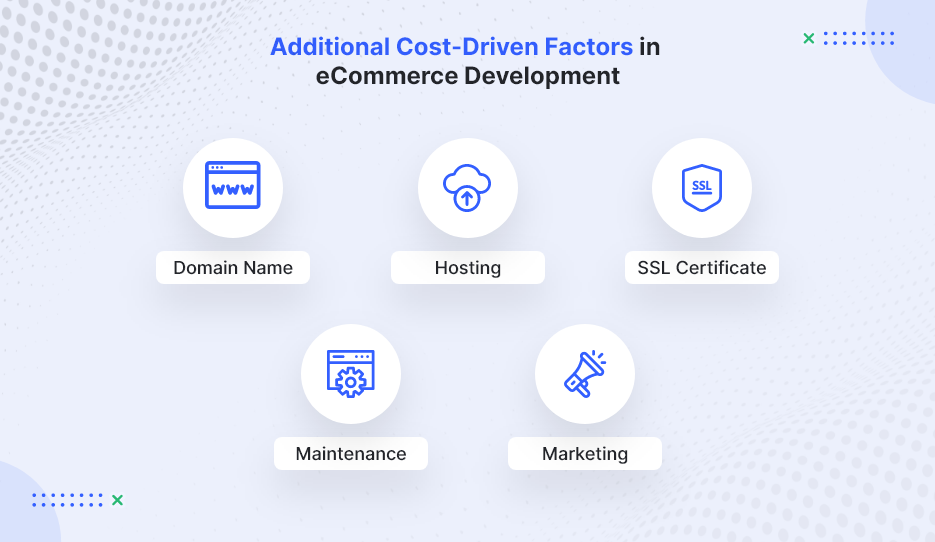
Image Source: WebMob
Start With the User: Audience Research That Shapes eCommerce UX
1. Define Your Audience, Products, and Goals Before Design
A practical way to prevent “pretty but hard to buy from” stores is to start with a simple chain: persona → UX decision. For example, if you sell quick meal solutions to busy professionals, your eCommerce UX should prioritize fast navigation, highlight prep time, and reduce checkout friction. To make this actionable, document:
- Top 3 customer goals (e.g., “find the right item fast,” “confirm delivery date,” “trust returns”)
- Top objections (price, fit/compatibility, shipping cost, legitimacy)
- Most common browsing pattern (category discovery vs. SKU search)
2. Build Browsing First (Especially for Small Catalogs)
A recurring lesson from early-stage marketplaces is that browsing often beats search when shoppers are exploring and don’t know what to type yet. For smaller, discovery-driven catalogs, a browsing-first experience can outperform search because it guides people toward decisions instead of asking them to already know what they want. Prioritize:
- Clear categories and collections
- Curated “new,” “best sellers,” and “giftable” paths
- Strong merchandising modules (related items, bundles, “complete the set”)
3. Taxonomy Is the Backbone of a User-Friendly Online Store
Your category structure isn’t a one-time menu decision—it’s a product that needs iteration. Teams regularly need multiple rounds of re-categorization before customers find it intuitive.
Practical taxonomy rules:
- Keep depth reasonable (avoid burying products under 5+ clicks)
- Add “shop by use case” paths (problem solved, recipient, compatibility)
- Use customer language—not internal jargon
- Validate labels with real shoppers (what they call it matters most)
eCommerce UX Trends That Make Stores Feel Effortless Right Now
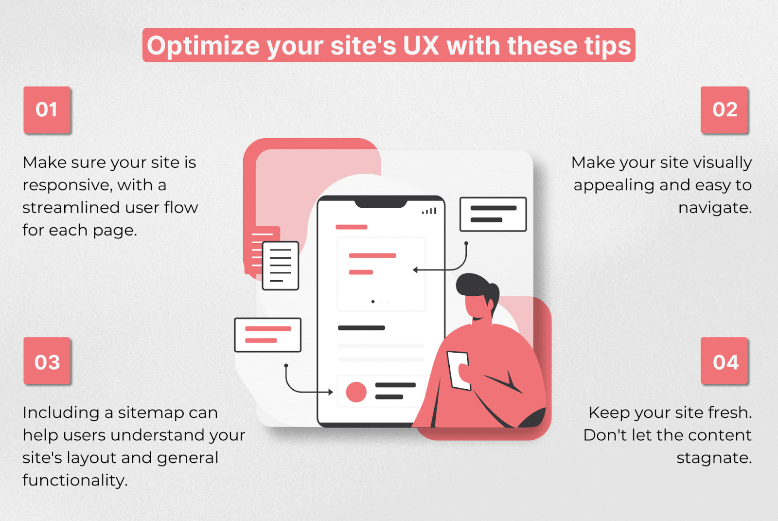
1. Mobile-First eCommerce UX (Responsive by Default)
Mobile-first is no longer a trend—it’s the baseline. Responsive layouts should adapt naturally across devices, but “mobile-friendly” also means you design for thumbs and limited attention. Focus on:
- Thumb-friendly navigation and tap targets
- Fast-loading product detail pages (PDPs)
- Minimal checkout steps and fewer form fields
2. Site Speed and Reliability Are UX Features
Performance affects trust and conversion. Downtime loses sales, and slow pages increase bounce rate—plus poor speed can harm organic visibility. Treat performance like core UX:
- Compress images and avoid heavy scripts/apps
- Use a quality host and CDN when applicable
- Monitor uptime and page speed continuously (not only at launch)
3. Smarter Discovery: Browse + Filters, Then Efficient Search
A modern discovery roadmap tends to look like this:
- Nail taxonomy and browsing
- Add filters/sorting as the catalog grows
- Introduce search when complexity demands it
When search becomes necessary, many stores use third-party search services/APIs to reduce engineering time and avoid maintaining a full indexing stack in-house. Some businesses also enhance discovery using AI-driven search and recommendation engines developed through generative AI development services.
Core Features of a User-Friendly eCommerce Website (Non-Negotiables)
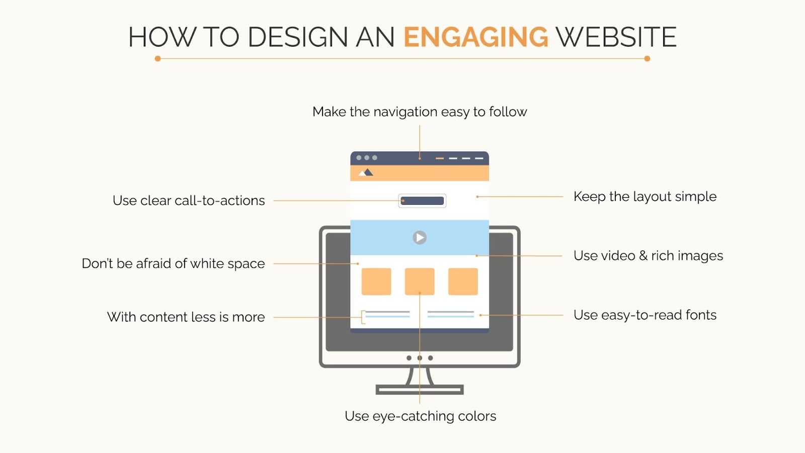
1. Navigation That Matches How People Shop
Navigation should reflect customer intent, not your org chart. Strong eCommerce navigation typically includes:
- Clear categories, breadcrumbs, and on-site pathways between products
- Sorting (price, popularity, newest)
- Filters (availability, size, rating, shipping speed)
If your platform supports it, add “related items” and “frequently bought together” to reduce dead ends and increase cart confidence.
2. Product Pages (PDPs) That Convert Without Friction
High-performing product pages reduce hesitation by answering questions early:
- Clear pricing, variants, and stock status
- Shipping and returns visibility before checkout
- Reviews, trust signals, and high-quality images/video
- Size guides/compatibility notes where relevant
3. Payments, Security, and Trust UX
Security is non-negotiable, but trust is also a UX problem. Customers need clarity and reassurance throughout checkout. Prioritize:
- Fraud prevention, backups, and proper payment security standards (e.g., PCI compliance for card processing)
- Transparent totals (shipping, taxes, fees) before the final step
- Clear confirmation emails and an easy refund/returns workflow
4. Shipping and Delivery UX
Shipping is part of the product experience. Make it easy to understand and hard to misinterpret:
- Delivery estimates, tracking, and local pickup (if relevant)
- Clear rules (free-shipping thresholds, regions, handling time)
- Upfront information on returns and exchanges
5. Back-Office Tools That Prevent Customer Pain
Operational issues quickly become common UX issues. Inventory errors, delayed fulfillment, and inconsistent listings create support tickets and lost trust.
Look for strong tools for:
- Inventory and order management
- Fulfillment workflows
- Promotions and email automation
- Multichannel selling readiness (marketplaces/social)
Biggest eCommerce UX Challenges (and How to Avoid Them)
1. Competing With Giants: Why Niche Stores Win on UX
Competing head-to-head with Amazon-style convenience is difficult. Niche stores win by offering a better decision experience:
- Specialized categories that match how buyers think
- Expert guidance, comparisons, and bundles
- Content that answers specific buyer questions (compatibility, sizing, use cases)
2. Overbuilding Too Early (Feature Bloat)
A common conversion killer is building complex features before you’ve validated customer behavior. Start with the smallest UX strategy that supports the core job: find → evaluate → purchase → receive.
What to do instead:
- Instrument key actions (PDP views, add-to-cart, checkout start, checkout completion)
- Improve the biggest drop-off point first
- Scale features only when customers prove they need them
3. Performance Issues (Speed + Hosting)
Speed problems often come from “death by a thousand add-ons.” Keep the stack lean and measure the impact of every extra script and widget.
How a Website Builder Software Helps Reduce eCommerce Complexity?
For many SMB teams, the biggest challenge isn’t choosing features, it’s managing the technical overhead behind them. Hosting setup, theme compatibility, plugin conflicts, performance optimization, analytics tools, and SEO integrations can quickly turn a simple store into a complicated stack.
This is where modern website builder software can help. Instead of assembling multiple tools, builders typically bundle core capabilities into one system, including:
- Hosting and infrastructure management
- Responsive templates optimized for eCommerce
- Built-in SEO settings and analytics tracking
- Drag-and-drop editing for faster page updates
- Security updates, backups, and performance monitoring
For smaller teams or first-time store owners, this reduces the need for ongoing developer support and shortens the time between idea and launch. It also makes it easier to test merchandising layouts, update product pages, and iterate on UX without rebuilding parts of the site.
Website builder software are often most useful when:
- Speed-to-launch matters more than deep customization
- The catalog is small to medium in size
- The team lacks in-house technical resources
- Ongoing maintainability is a priority
They may be less suitable for stores that require highly specialized integrations or complex backend workflows. But for many SMBs, a builder platform provides a practical middle ground between rigid templates and full custom development.
Reducing Technical Overhead with Unified Website Platform
For SMB teams that want to avoid stitching together hosting, design tools, plugins, analytics, and marketing integrations, all-in-one website ecosystems are becoming a practical alternative to traditional builds.
DashClicks’ Sites platform is one example of this approach. It combines a drag-and-drop website builder software, responsive templates, built-in eCommerce functionality, and integrated SEO tools in a single dashboard. Instead of managing multiple vendors for hosting, site edits, and optimization, teams can handle updates, product pages, and performance tracking from one place.
This kind of setup can be particularly useful when speed-to-launch and maintainability matter more than deep customization. For smaller catalogs or growing online stores, the ability to adjust layouts, add pages, and optimize content without developer support can reduce ongoing costs and allow faster iteration.
Platforms like this are typically best suited for:
- Small to mid-sized stores that need to launch quickly
- Teams without in-house developers
- Agencies managing multiple client websites
- Businesses that want built-in SEO and analytics rather than separate tools
They may be less ideal for stores requiring highly custom checkout flows, complex backend integrations, or unique front-end functionality, where custom development still provides more flexibility.
For many SMBs, though, DashClicks can offer a middle ground between rigid templates and fully custom builds, helping them launch faster while keeping their site easier to maintain over time.
Conclusion
A user-friendly eCommerce website is built, not decorated. The reliable formula is: audience research → strong taxonomy and browsing → trust and checkout fundamentals → mobile + speed → continuous iteration via feedback.
Start with the smallest set of features that makes shopping effortless, measure real behavior, and scale only what customers prove they need. That approach keeps your store fast, maintainable, and easier to market over the long term—exactly what SMB teams need to grow sustainably.

.svg)


.svg)
.svg)
.svg)
.svg)
.svg)