

.svg)

.svg)
.svg)
.svg)
.svg)
.svg)
In today's digital landscape, responsive web design transcends the realm of luxury and plants itself firmly as a necessity.
Imagine this: with over 6.4 billion smartphone users worldwide, each flipping through content on devices ranging from palm-sized to panoramic, the demand for web pages that adapt flawlessly to every screen dimension is not just high it's essential. Enter the unsung hero of responsive design: the viewport meta tag.
Diving into the nuts and bolts, viewport meta tags are the architects of adaptability, instructing browsers on how to adjust content to fit various screen sizes perfectly. Why does this matter?
Consider that 48% of users cite a website’s design as the number one factor in deciding the credibility of a business. In a world where first impressions are digital, ensuring your web presence is as polished and accessible as possible is non-negotiable.
But how do you harness the power of viewport meta tags in your web projects? This comprehensive guide will not only explain their significance in the grand tapestry of web design but also provide step-by-step instructions on their effective implementation.
Understanding the Viewport Meta Tag
At the core of creating responsive designs is understanding the viewport meta tag, a powerful HTML element that instructs the browser on how to control the page's dimensions and scaling.
Think of the viewport as a window through which users view web content. In the context of mobile devices, this window is not fixed; it changes with device orientation (landscape or portrait) and with different screen sizes.
Without specifying viewport settings, your website could appear tiny and unreadable on mobile devices, requiring users to pinch and zoom to engage with your content hardly the seamless experience modern web users expect.

Image Source: Seobility
The viewport meta tag essentially allows web developers to set the width and scale of this "window" to match the viewing environment. It is typically implemented in the '<head>' section of an HTML document as follows:
'<meta name="viewport" content="width=device-width, initial-scale=1">'
This line of code tells the browser to set the page width equal to the device's width and start with a 1:1 scale, meaning no zoom. The result?
A webpage that looks and functions correctly across a multitude of devices, enhancing user engagement and accessibility. Understanding and correctly utilizing the viewport meta tag is the first step in crafting web experiences that are truly responsive.
Viewport Tag Attributes
The viewport meta tag can have several attributes, but the most common ones are width, initial-scale, user-scalable, and maximum-scale. Each of these attributes is used to control a different aspect of the viewport:
- Width: This attribute defines the width of the viewport, permitting the layout's width to match the device's physical width regardless of the screen size. This capability is crucial for creating responsive designs that automatically adjust to different devices, ensuring a consistent user experience across smartphones, tablets, and desktops.
- Initial-scale: This attribute describes the initial zoom level of the web content when the webpage is first accessed. Setting this value to 1 ensures that the content is displayed at its true size, according to the CSS and HTML definitions, without any zoom applied.
- User-scalable: A Boolean attribute that plays a significant role in accessibility and user control over the webpage. It determines whether users have the ability to manually zoom in and out of the page using pinch gestures on touchscreens. When set to 'no,' it restricts this capability, which can be useful in certain contexts where maintaining a specific layout or design is important. However, it's crucial to consider user accessibility needs when deciding on this setting.
- Maximum-scale: This attribute specifies the maximum extent to which a user can zoom in on the page. It provides control over how much users can increase the size of content, which can be particularly useful for readability or examining fine details.
If 'user-scalable' is set to 'no,' however, this attribute will not have any impact, as user-initiated zooming is altogether disabled. Setting this attribute requires careful consideration of the balance between user control and preserving the intended user experience.
Why Viewport Meta Tags Matter?
In the world of web design, viewport meta tags play a pivotal role in creating sites that provide a seamless and engaging user experience across a multitude of devices. Here, we explore the key reasons why these tags are indispensable in modern web development:
- Enhanced User Experience: By enabling webpages to automatically adjust to the size of the device's screen, viewport meta tags ensure that content is easily readable and accessible without the need for manual zooming or scrolling. This results in a smoother and more satisfying browsing experience for users.
- Improved Mobile Responsiveness: With the majority of internet traffic coming from mobile devices, having a website that performs well on smartphones and tablets is critical. Viewport meta tags are the foundation of responsive design, allowing developers to tailor websites to fit any screen size perfectly.
- Better SEO Rankings: Search engines favor mobile-optimized websites when ranking search results. By implementing viewport meta tags, you signal to search engines that your site is designed for mobile, potentially boosting your site's visibility and rankings.
- Possible Reduced Bounce Rates: A site that is difficult to navigate or read on a mobile device can lead to high bounce rates, as users may quickly leave in frustration. By ensuring your site is mobile-friendly with viewport meta tags, you can keep users engaged, thereby reducing bounce rates.
- Future-proofing Your Website: The range of devices and screen sizes is continually evolving. Utilizing viewport meta tags makes your website more adaptable to new devices, ensuring it remains accessible and user-friendly long into the future.

Image Source: GoodFirms
Understanding and correctly implementing viewport meta tags can significantly impact the effectiveness of a website, making it a critical consideration for developers looking to meet and exceed the demands of today's web users.
How Viewport Meta Tags Affect Marketing Performance?
Viewport meta tags play a crucial role not just in the technical realm of web design, but also significantly impact the effectiveness of digital marketing strategies. In today's mobile-first digital landscape, a website's compatibility with various devices directly influences its ability to engage and convert potential customers.
Here are several ways viewport meta tags can enhance marketing performance:
- Increased Engagement and Conversion Rates: Websites that are optimized for all screen sizes tend to have higher engagement rates. Users are more likely to stay on a page that is easy to read and interact with, regardless of the device they are using. This improved user experience can lead to higher conversion rates, as visitors are more likely to take the desired action, be it signing up for a newsletter or making a purchase.
- Enhanced Brand Perception: A website that scales and functions seamlessly across devices presents a professional image to visitors. This directly impacts a user’s perception of the brand, associating it with modernity, care for customer experience, and technological savvy. In the competitive digital market, positive brand perception is invaluable for standing out among competitors.
- More Effective Mobile Advertising: With ads being a significant part of many companies' digital marketing strategies, ensuring that your website provides a positive experience for mobile users is crucial. This is particularly important when conducting mobile advertising campaigns. If users click an ad on their mobile device only to find a poorly optimized landing page, the likelihood of bounce increases. Conversely, a mobile-optimized site can capitalize on mobile ad clicks effectively, leading to better advertising ROI.
- Lower Bounce Rates: Websites that are not optimized for mobile devices often suffer from high bounce rates, as users may find it difficult to navigate or engage with content. By using viewport meta tags to ensure your site is accessible and user-friendly on any device, businesses can significantly lower bounce rates. This not only improves the overall site performance but also positively influences SEO rankings, making the site more visible to potential customers.
- Competitive Advantage: In sectors where not all players have adopted responsive design principles, implementing viewport meta tags can provide a significant competitive advantage. It ensures that your website offers a superior user experience, which can be a decisive factor for users comparing services or products online.
In essence, the technical aspect of including viewport meta tags transcends mere web design and reaches into the heart of digital marketing strategies.
By ensuring your website is accessible, legible, and user-friendly on any device, you lay a foundational stone for engaging users, improving brand perception, driving conversions, and ultimately enhancing your digital marketing performance.
Implementing Viewport Meta Tags
Now that you understand its importance, it’s time to implement the viewport meta tag effectively in your web project.

Image Source: Semrush
Here's how you can do it -
1. Always Set the Initial Width
The 'width' attribute is the foundational setting for your viewport. It decides how much of your content will be displayed by default. You can use a fixed value in pixels, such as 'width=500', but it's more common to see the device's width used dynamically with 'width=device-width'.
2. Choosing the Right Initial Scale
The `initial-scale` attribute lets you specify how the entire web page should be scaled when it first loads. A value of 1 ensures that the content is not zoomed, which is the recommended practice for most websites. However, if your design is meant to appear zoomed by default, a larger value may be appropriate.
3. Allowing or Disabling User Scaling
The 'user-scalable' attribute controls whether users can manually zoom in and out of your web page. In most cases, setting this to 'no' is a good idea. This helps maintain a consistent design and avoids unexpected issues with your layout.
4. Setting a Maximum Scale
If you do decide to allow zooming, the 'maximum-scale' attribute can help prevent excessive zoom that might distort the page. This is a safeguard to ensure that even if users can scale, they can't completely break the layout.
Common Challenges With Viewport Meta Tags
While the viewport meta tag is a powerful tool, it's not without its challenges. Here are some common issues you may encounter and how to address them.
- Hardcoded Viewport Values: Using hardcoded values in the viewport meta tag can lead to a poor user experience. It's essential to rely on relative values that respond to the user's device and browser settings, such as 'width=device-width' or 'initial-scale=1'.
- Inconsistent Rendering Across Devices: The viewport tag is just one piece of the responsive web design puzzle. Make sure all your CSS is optimized for different screen sizes and resolutions to avoid issues with layout and readability.
- Desktop-Specific Viewport Configurations: Don't forget to include a viewport meta tag in your page's HTML, even for desktop designs. While the default behavior in most desktop browsers is acceptable, explicitly defining your viewport ensures your site is displayed as intended.
Best Practices for Using Viewport Meta Tags
Implementing viewport meta tags effectively is vital for optimal user experience. Here are some best practices to keep in mind as you work with them.
- Test, Test, Test: Your design should look good and work well not just across different devices, but also across different browsers on those devices. Regular testing throughout the development process is essential.
- Use a Framework or Responsive Template: Leveraging a CSS framework or a responsive template that's already optimized for various viewports can save you a lot of time and headaches. These tools often come with solid viewport meta tag defaults and responsive utilities that make your job much easier.
- Keep Your Design Simple: The cornerstone of a successful responsive design lies in its simplicity. By steering clear of unnecessary clutter and honing in on the essential elements, you can guarantee that your web pages not only load swiftly but also maintain an appealing aesthetic across all devices. It's crucial to optimize images, streamline content, and employ flexible grid layouts to ensure a seamless user experience, regardless of whether your audience is accessing your site from a mobile phone, tablet, or desktop computer. This strategic focus on simplicity and functionality is what ultimately makes a responsive design effective and user-friendly.
- Prioritize User Experience: Always design with the end user's needs and preferences at the forefront of your mind. It's crucial to ensure that your content is not only easily accessible but also clear, readable, and engaging, no matter the device or screen size being used.
This means paying close attention to layout, font sizes, and interactive elements to create a user-friendly experience that adapts seamlessly across all platforms.
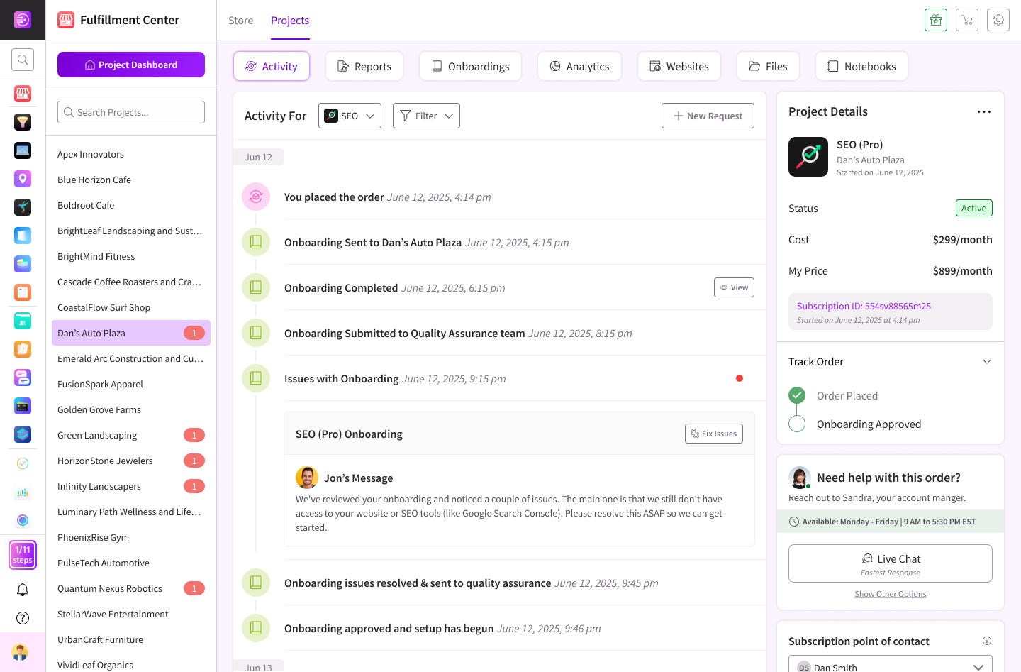
Leveraging DashClicks Identifying Viewport Meta Tag Issues
In the intricate process of ensuring your website is fully responsive and optimized, tools like InstaReports software by DashClicks become indispensable. This powerful tool offers a deep-dive analysis of your website's performance, highlighting areas that require attention—including potential issues with viewport meta tags.
By using white label website audit tool, web developers and site owners can quickly identify whether their site's viewport settings are optimized for a wide range of devices, ensuring the user experience remains consistent and engaging across all platforms.
This level of insight is crucial for troubleshooting common viewport meta tag challenges, such as improper scaling or user zoom limitations, that could otherwise negatively impact the site's accessibility and user engagement.
Beyond the identification of viewport meta tags issues, DashClicks offers comprehensive white label SEO services designed to enhance your website's overall performance and visibility. These services are crucial for businesses looking to optimize their site without the overhead of an in-house team.
DashClicks' SEO experts work behind the scenes, employing the latest techniques and strategies to improve search rankings, drive traffic, and increase conversion rates. This includes on-page optimization, backlink building, content creation, and more, all tailored to meet the specific needs of your website and your target audience.
Utilizing DashClicks' white-label SEO services not only helps in resolving viewport meta tag issues identified by InstaReports but also enhances the site's SEO performance, making it more competitive and visible in today's digital landscape.
In Conclusion
The viewport meta tag, though small in size, is a mighty component of your web page that plays a crucial role in enhancing the user experience. This tag helps web developers control how a page is displayed on different devices, ensuring that the content scales and renders effectively irrespective of the screen size.
By mastering the use of the viewport meta tag, developers can make certain that their website not only looks appealing but also operates seamlessly across a variety of devices, from smartphones to desktop computers.
The inclusion of viewport meta tags is not just a recommended practice but a fundamental step in crafting a web presence that not only captivates but also efficiently serves the needs of the broadest audience possible. Understanding and implementing this tag correctly is essential for anyone looking to create a responsive, accessible, and user-friendly website in today's digital age.


.svg)


.svg)
.svg)
.svg)
.svg)
.svg)