

.svg)

.svg)
.svg)
.svg)
.svg)
.svg)
Your website is the most powerful medium for conversion, and you can use various tools to boost conversion.
Sign-up web forms also help you build your mailing lists and collect important data about your prospects. Read this article to learn how to create impactful forms in seconds and embed them on your website.
You'll also learn how to create sign-up forms with DashClicks' forms builder software for maximum conversion.
Tips to Create Sign-up Forms for Better User Experience
Here are 11 tips on how to create sign-up forms for better user experience and conversion.
1. Keep User Experience on the Top
To generate more leads, you need to focus on user experience. So, it's recommended that your email sign-up forms should be eye-catchy, brief, and clutter-free. Grab the visitors' attention in the first five seconds or lose them forever. It's your choice.
To achieve this, you can take the following steps:
A. Increase the Dimensions of Your Form Fields
People use different devices, and many won't use any tab button as they use touchscreens. So, the button's visibility is crucial to the user experience.

B. Avoid Having Two Columns Fields
A two-column field might be suitable for desktop users, but it's extremely inconvenient for mobile users. Since most people are mobile users, avoid using two-column fields. Many people may skip the second column on the first attempt, delaying the entire sign-up process.
C. Stick To Four Fields or Less
Don't test people's patience. With decreasing attention spans and disposable time, people are unwilling to sign up for long forms. Most people prefer to opt-out if it takes too much time. A recent survey adds weight to it, revealing that fewer form fields have attracted the highest conversion rates. More fields are considered clutter, and modern marketing gurus warn against that.
Shorter forms are less intrusive to visitors. Visitors also don't feel comfortable providing you with certain personal information. So, eliminate all the unnecessary fields from your forms.
Do you need a user's phone number when you sign up for an email newsletter? Most visitors don't want to give unnecessary information.
2. Know When to Use One or Two Columns
Sometimes longer forms are your business requirement. For example, if your form has 16 fields, it would look boring and intimidating to stack them above one another. It may also not fit on one page.
It would look more attractive if you split it into two columns with eight fields each. It would also fit on one page without scrolling further. Studies prove more conversion with two columns compared to one long scrollable list when you have a long sign-up form.

3. Offer an Incentive to Sign Up
Why would someone sign up for your firm form if there is no incentive or reward? You can drive more conversion if you offer an incentive for the user. You should provide a free subscription or a discount on your product to sign your form.
You benefit from this sign-up, so you should also offer some value. You should show some value propositions to encourage people to fill up your form.
4. Enable Autocomplete
It is an exciting feature that saves a lot of time for users. Since you're not the first company to ask for user details, your browser will store the previous information and allow you to autocomplete such forms.
It prevents you from repeatedly entering the same information. So as soon as you put the cursor inside a field, the autofill option will start appearing.
You can fill in the field as suggested, and the form will be ready within seconds. The autocomplete feature becomes even more relevant when you have long forms to fill up. According to Google, the autocomplete feature helps to complete the forms 30% faster.

5. Allow Social Sign-Ups
Social sign-ups also allow users to complete the forms with a click. Integrate your website with a few social media channels, and your users will be able to do it. Social sign-ups can be an exciting feature for you to speed up user information collection. Facebook is the most popular social media channel for sign-up forms integration. Follow the Facebook developer instructions to integrate this feature with your website.
6. Avoid CAPTCHAs
The Completely Automated Public Turing Test, or CAPTCHA as we call it, is an online filter that we use to differentiate human website visitors and bots. Websites use it to filter spam.
Data scraping tools and bots can manipulate your website and complete several actions meant specifically for humans and authorized users. This technology is used to knock out such bots and malicious programs.
You must have come across this to verify that you're not a robot.
I'm sure you've seen these before. It's one of those steps you must take to verify you're not a robot.
Here's what it looks like -

7. Eliminate Distractions
Lead generation is a crucial step. Multiple forms, pop-ups, graphics, videos, and unnecessary elements near your online form may distract the user and prevent them from filling it up. So, try to minimize the distractions and remove ads, extra wording, GIFs, photos, or videos around the lead generation form.
8. Focus On Opt-in Placement
The location of your sign-up form on your website also matters. Usually, the form appears on multiple locations on different landing pages. And sometimes, it's also not your priority, especially if you are an eCommerce store and sales is your no. 1 priority.
You can usually find an email sign-up opt-in in the websiteā€™s footer. But don't take it as an ideal position, especially when you use the sign-up form to drive revenue.
You can try different locations based on their visibility. It can be the sidebar of your blog posts, where it appears prominently. You can also make it appear as a pop-up. So, whatever the location, choose it wisely.
9. A/B Test Your CTA
The CTAs can affect the conversion rate, so you can't sit idle once CTA and form have been decided. Constantly perform A/B testing to see what works best.
Make minor changes in the following elements and see what happens –
- Wording
- Size
- Placement
- Font
- Color

10. Showcase Social Proof
Social proof helps boost conversions, and you can use them in your sign-up forms. People respect and trust others’ opinions, and when they see that others have tried and tested the product and benefited from it, they’ll also get curious to test it.
Social proof will accelerate the decision-making at the bottom of the sales funnel when people are just ready to make the final decision.
11. Other Tips
Here are other tips you should follow while designing a sign-up form for your website.
- Use sentence case
- Avoid asterisks and confirm password form fields
- Give clear instructions and avoid complexity in the fields
- Use a visible and prominent sign-up/CTA button with a clear message
- Ensure text and form field box alignment
- Inform the prospects about the next thing they can expect after they sign-up
How to Create a Sign-up Form With DashClicks’ That Converts?
DashClicks offers a form builder app that can create custom forms for any data collection with an easy-to-use, drag-and-drop form builder.
What Is the Forms Application?
DashClicks’ Forms application is a highly useful marketing tool that allows you to quickly create, share, and embed forms on your websites and landing pages. You can use these forms in place of default forms on other platforms to keep all of your lead information in one convenient place.
Watch this video to create a sign-up form –
You can find the details of creating different types of forms in the following help articles:
Form Templates
You can find many pre-made sign-up form templates for you to use in the Templates tab in the Forms app. There is no need to create a form from scratch, as you can browse our wide selection of forms to help you get started.
In the Templates, you'll find forms already set up for a specific purpose, such as collecting leads or booking appointments and require no additional work on your part.

Look at the various categories in the left-side column on the page. Browse them, click on a type you're interested in, select a sign-up form template, and start building!
You can also use the search bar located on top for the purpose.
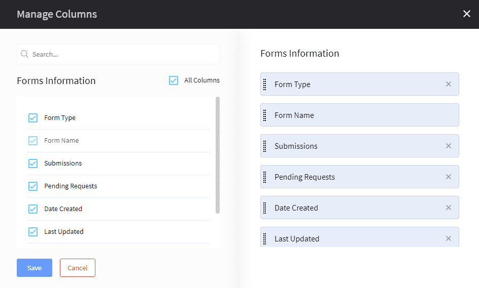
Customizing the Forms App
The forms app provides some basic options for customizing your experience. You can customize columns, fields, and items per page.
You can also categorize and tag your forms in the app. For details, click the support doc.
Final Words
Creating sign-up forms is a popular technique to generate leads and build your mailing lists. Using the customer data collected through forms, you can learn more about your prospects and people interested in your brand. You can easily increase conversions through a visually appealing and easy-to-follow sign-up form.
DashClicks' Forms App contains a form builder that helps you create custom forms to make data collection a breeze. The drag-and-drop form builder keeps your forms organized and makes them easy to manage. The app offers hundreds of pre-built form templates to save time and speed up your workflow.


.svg)


.svg)
.svg)
.svg)
.svg)
.svg)